For a while now, I've been watching the AI wave from close range. Using the tools every day, reading the takes, nodding along. But I wanted to know what it actually felt like to build something with AI myself. Not read about it. Not listen to someone else's case study. Build.
There was a second question quietly tugging at me too. As a designer, I've spent my career making software for other people, and I'd always wondered what it would feel like on the other side. To use an app designed entirely around me. Every default, every column, every bit of copy shaped to how I actually think and work.
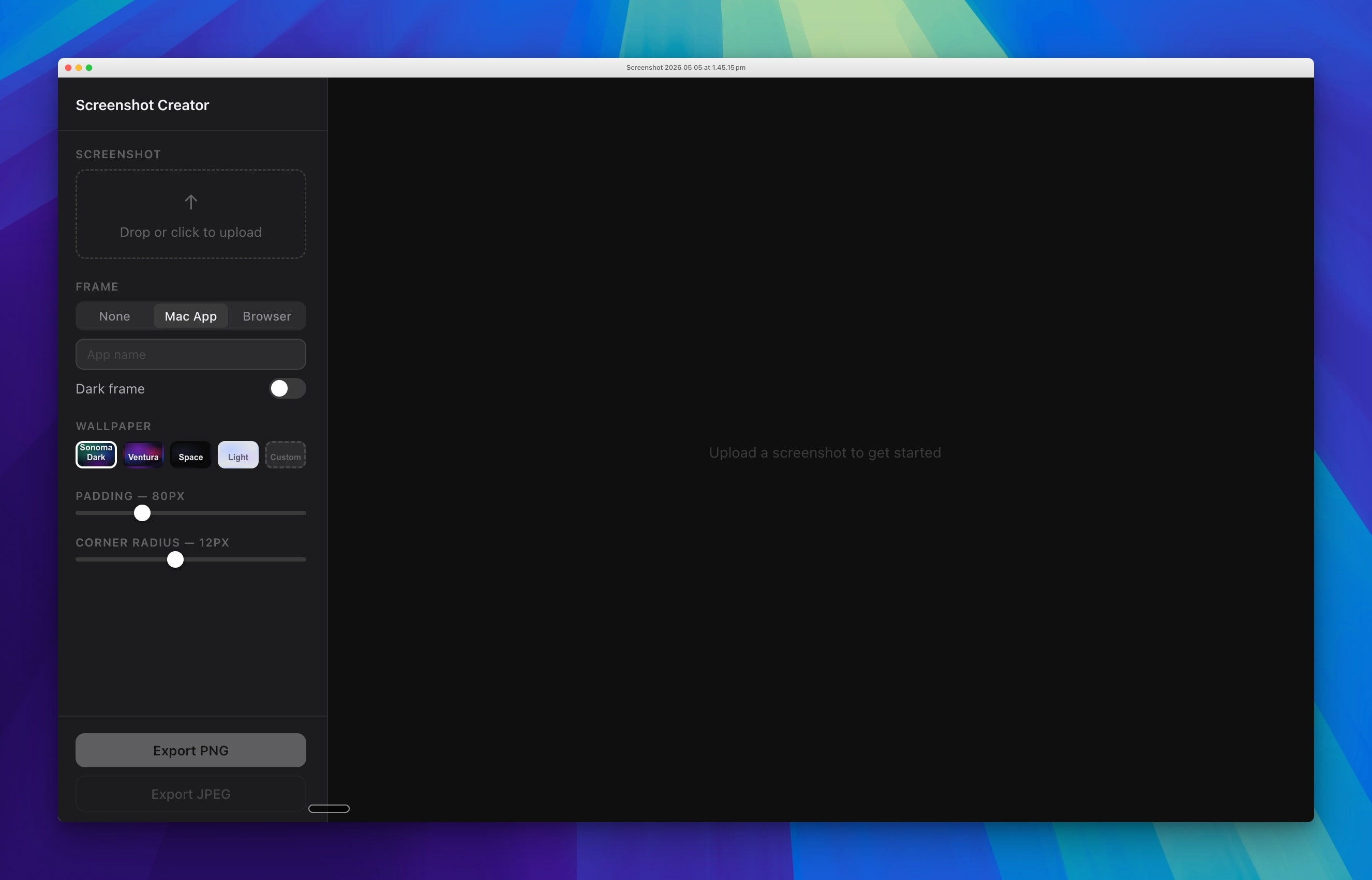
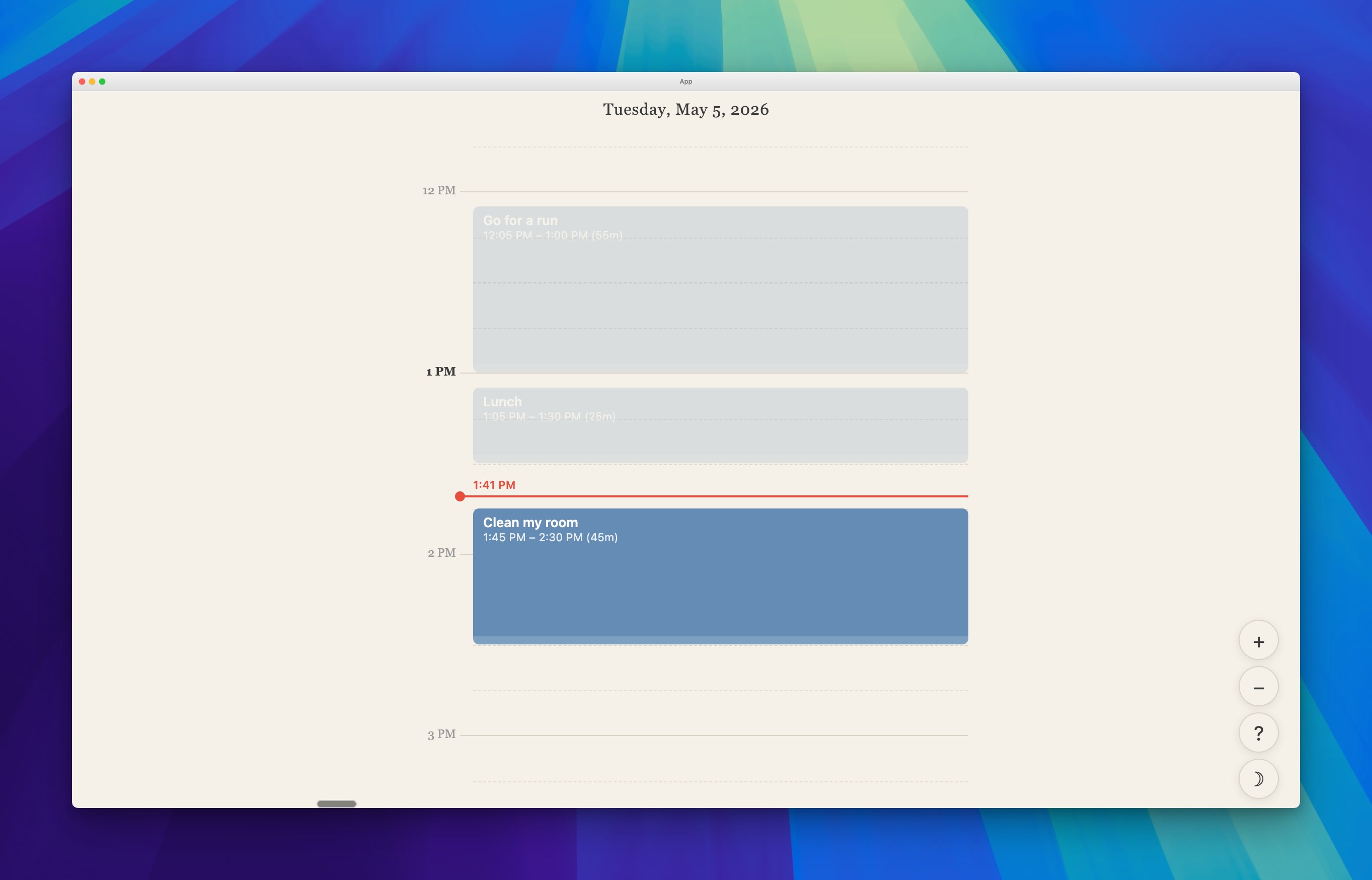
So I started building. First a screenshot tool, because I kept paying for tools that did one thing I needed and twenty I didn't. Then a day planner - a single focused view for planning one day at a time, without the noise of a full calendar. Small things. Contained things. But each one built a kind of confidence I hadn't expected: that I could actually finish something, that the feedback loop was fast enough to stay motivated, that the gap between an idea and a working thing was narrower than I'd assumed.
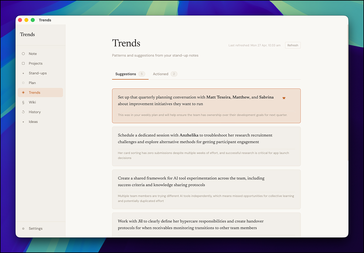
That confidence is what led to Trends. A personal leadership tool that holds my notes, reads them back, and surfaces the things I should be paying attention to as I run two design teams. Something I wouldn't have attempted first.
What I didn't expect was how much the making would teach me. About AI, about my own taste, and about the design choices we get away with - or don't - when we're building for other people. Six things have stayed with me.
The brief writes itself when you talk it through
I started with "I want a note-taking app." I ended up with a personal leadership intelligence tool. The distance between those two briefs got covered in conversation, not in a doc.
I didn't sit down and write a spec. I opened Claude (not Claude Code, just Claude) and started talking. I was using a voice tool called Wispr Flow at the time, and it quietly changed the shape of that conversation. Talking ideas out loud is different from typing them. Looser. More exploratory. More honest. I'd ramble, Wispr would transcribe, Claude would catch the through-line.
That's how a note app became Trends. As I kept talking, the deeper need surfaced: I manage two design teams, and my biggest fear is that things fall out of my purview. Projects that drag on. People who go quiet. Blockers that keep reappearing. I wanted something that could hold all of that for me, read it back intelligently, and surface what I should be paying attention to.
The brief you arrive at is almost never the brief you start with. Conversation - out loud, exploratory, with something on the other end pulling threads - is a faster and more honest way to find the real one than any document.
Point at something the model already knows
I had strong opinions about how Trends should look from the start. Warm cream tones, serif typography, something that felt more like a notepad than a dashboard. I kept those opinions in my back pocket and focused first on whether the thing actually worked.
When the time came to think about how the app looked and felt, I had a simple brief - make it feel like Claude.
I said this partly because I love the Claude interface. The warmth of it, the restraint, the way it feels like a tool that respects your attention. But I also said it because I had a hunch Claude would know how to interpret that instruction better than almost any other reference I could give.
I was right. Describing the aesthetic (cream palette, serif typography, tactile rather than hypermodern) in the language of something Claude already knew produced results that genuinely surprised me. The app doesn't look like a side project. It looks considered.
Aesthetics still matter. The lesson is that with the right reference point at the right moment, you can travel a long way without being a visual designer yourself. Vague aesthetic language is harder to interpret than a concrete, shared reference. Always point at something.
The same AI that builds with you teaches you
The first version of the trends engine was a heuristic system - keyword matching, pattern recognition, rules I'd written by hand. It was arbitrary and brittle. It would flag "Planning Beta" as an unknown person's name. It couldn't understand context. It was, frankly, not very useful.
But it worked. And because it worked, even poorly, I could see what I actually wanted. The moment the system flagged a project name as a team member was the moment I knew the heuristic approach had to go. I went back to Claude: I want it to feel as though I've sent the notes to an LLM that actually understands what it's reading. The answer was simple. Just do that.
But I'd never made an API call in my life. I didn't have a Claude developer account. I didn't know what an API key was for, where it lived, or which SDK to install. A couple of years ago, that would have been a multi-day detour, or a quiet reason to abandon the idea altogether.
Instead, I asked Claude how. It walked me through setting up the developer account, generating a key, installing the SDK, and making the first call. By the end of one session I had a working LLM integration - and I'd learned a thing I'd been quietly avoiding for years.
This is the part of building with AI I didn't see coming. The friction of acquiring a new tool - a new platform, a new SDK, a new piece of vocabulary - has quietly collapsed. The walls in a project used to be where I'd stop, or ask someone, or take a day to read documentation. Now they're the next thing I learn. Sometimes I don't notice I've crossed one until I look back.
It isn't just that AI helps you build things faster. It's that the territory you're willing to cross has gotten much bigger.
What actually got built
Over time, Trends grew into something bigger than a single page. Each feature came from a real gap, noticed through use:
- Notes - general notes that feed into everything else. The raw material.
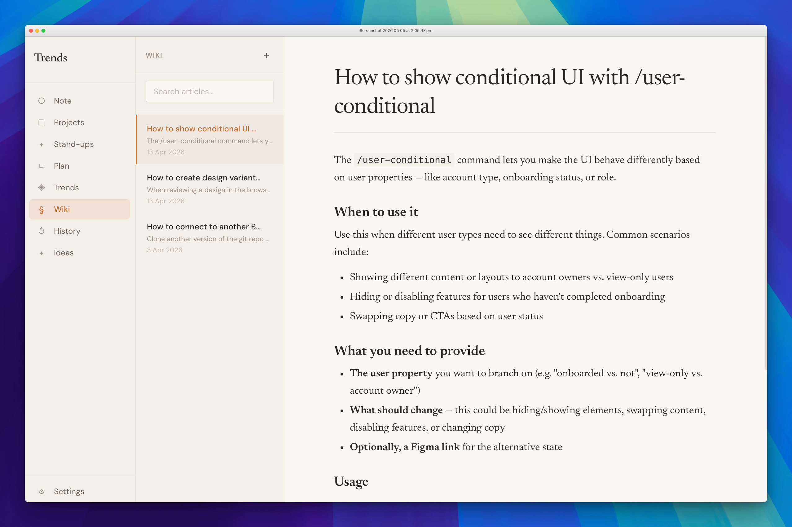
- Wiki - a personal knowledge base for team context, decisions made, things I'd otherwise lose to memory.
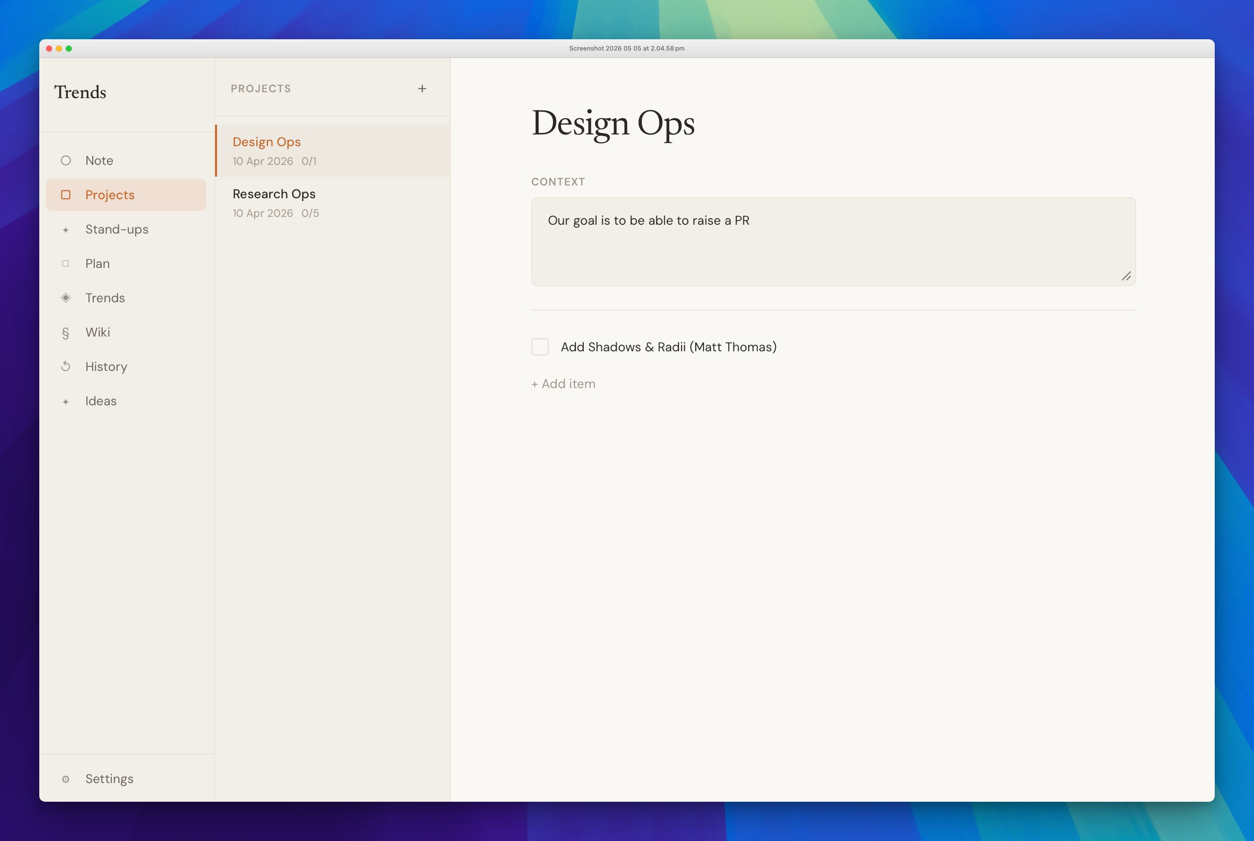
- Projects - a context-rich checklist for managing work within a specific frame. Each project carries a context field that tells me not just what needs doing, but why it matters right now.
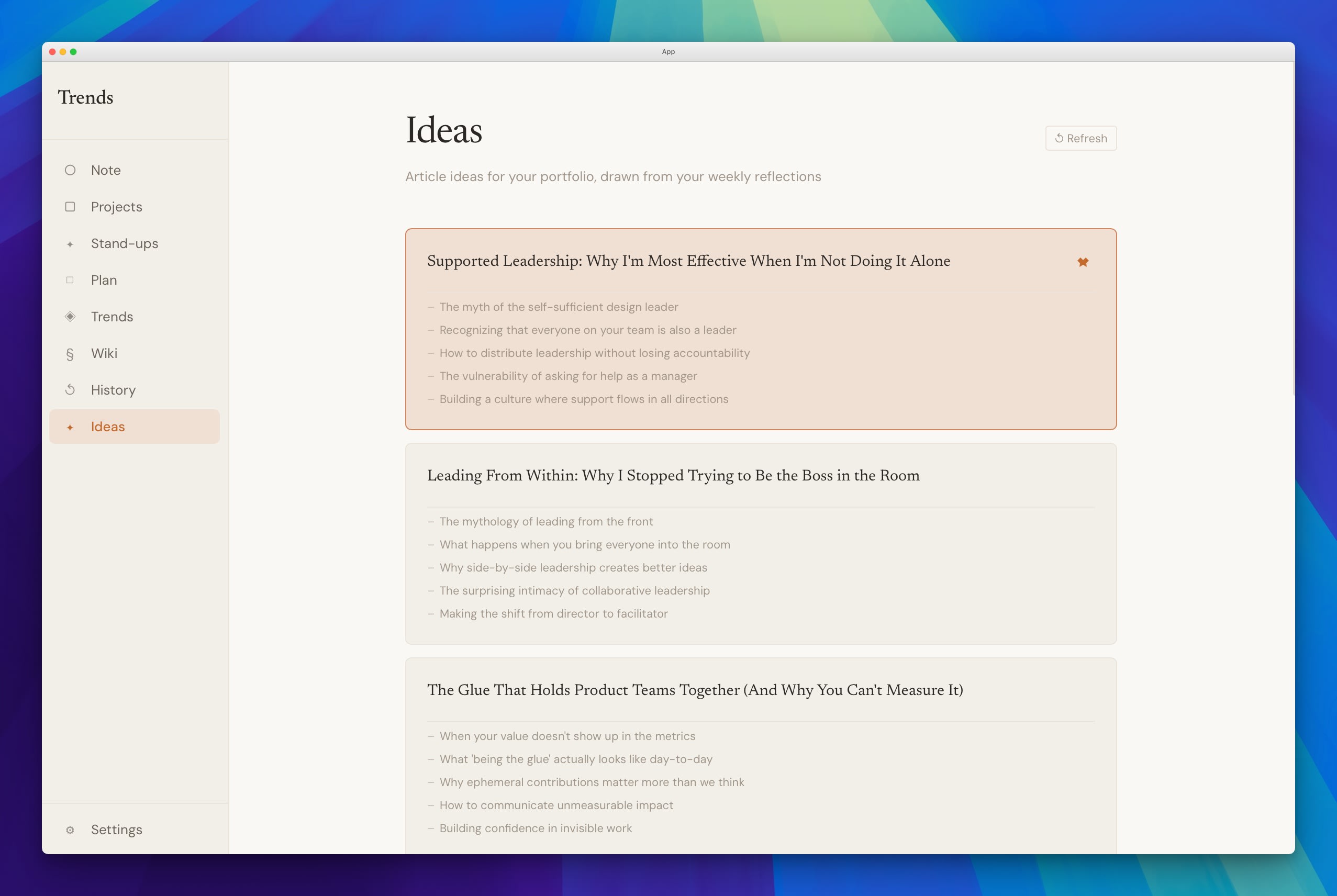
- Trends - reads across all my notes, context, and projects, then surfaces what I should actually be thinking about. Not a task list. A read on what deserves my attention.
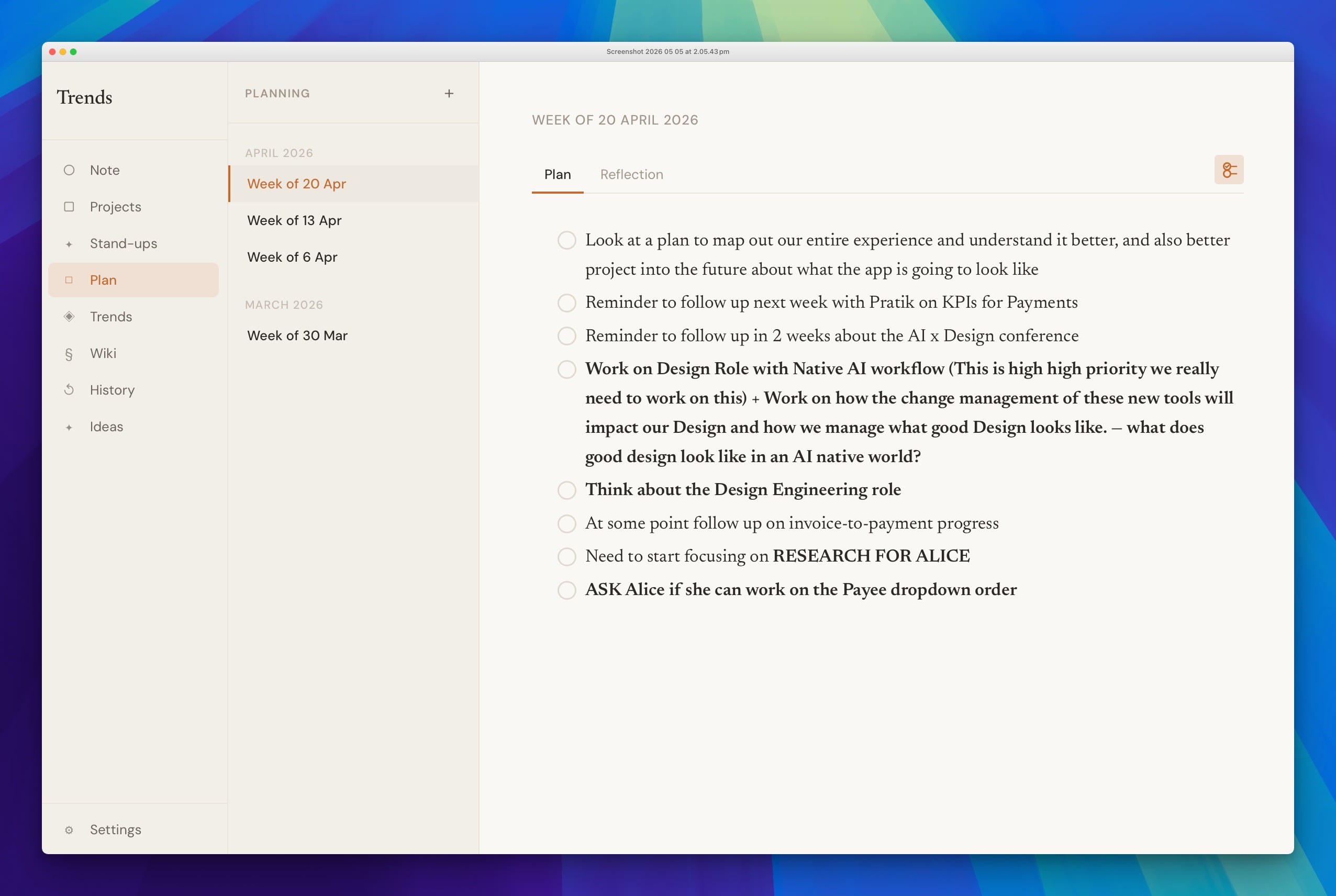
- Plan - a weekly planning view with two prompts: what I want to focus on this week, and a reflection at the end of it.
- Ideas - pulls from my reflections and surfaces things I could write about. This article started as a Trends idea.
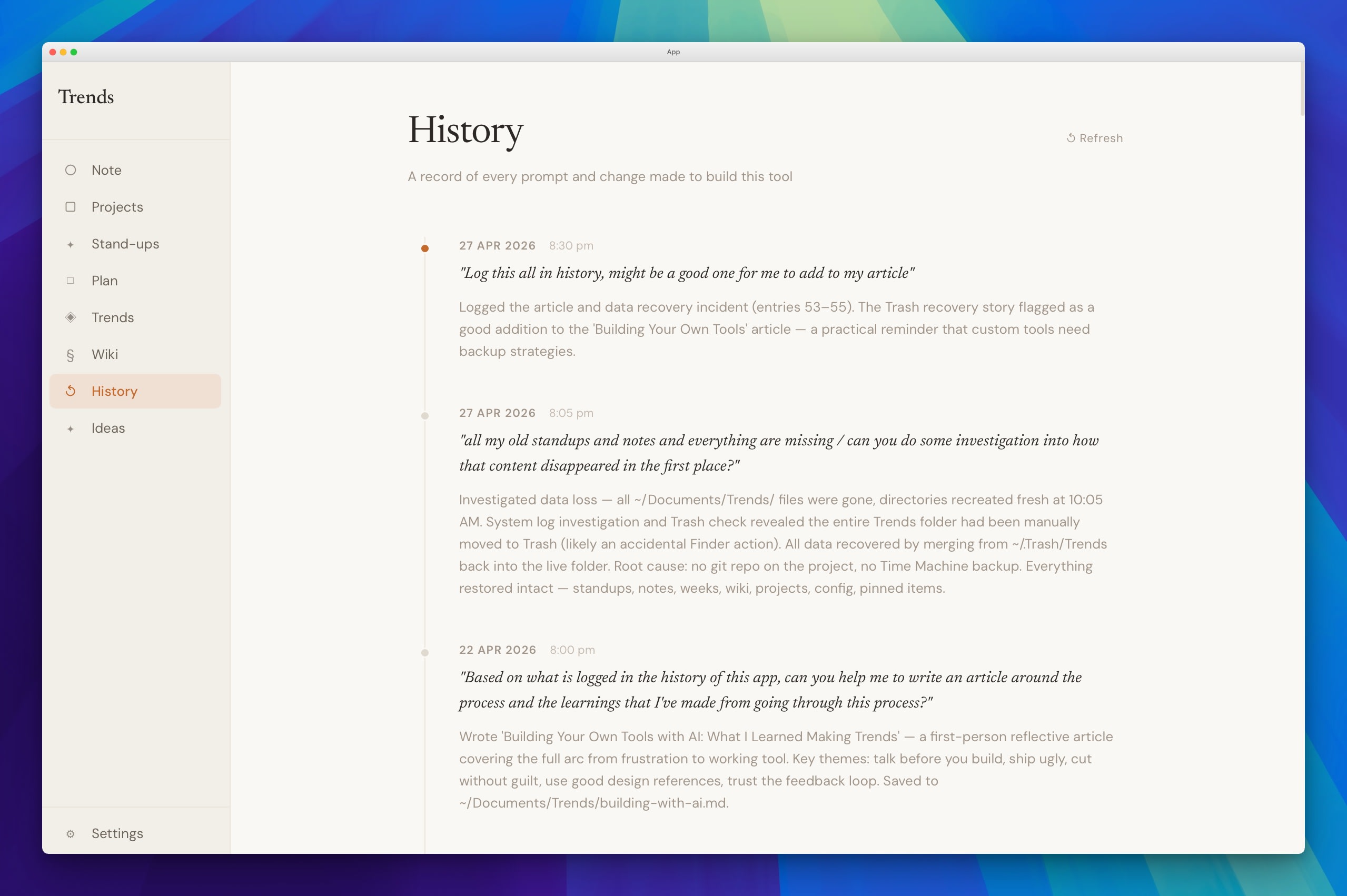
- History - a running log of how the app itself is evolving.
An audience of one lets you cut without guilt
The Trends page originally had two sections, Observations and Suggestions. After using it for a few weeks, I noticed I never read the observations. I always went straight to suggestions. So I removed the observations entirely. One prompt. Done.
This is one of the most underrated parts of building for yourself: you can be ruthless in a way you never could with a product for others. There's no stakeholder to convince. No user research to commission. No PM asking what the data says. You just know.
The features that stayed in Trends are the ones I actually use. The ones that didn't earned their removal honestly, through real use. I think about this often at the day job now - how much of what survives in our products survives because removing it is harder than keeping it, not because anyone genuinely uses it.
Most of what you build, you won't keep using
Tools built for the mainstream make compromises to serve the widest possible audience. When you build for yourself, you have none of those constraints. The brief is wide open. So you build all the niche things you've always wanted.
And then you realise: the things you actually reach for every day are only about 10% of what you built. The day planner. The screenshot tool. The Trends page. The wiki. That's it. The rest - features I built because I could, because they seemed useful in theory - I barely open.
It turns out the 90% problem doesn't disappear just because you're building for one person. Tools built for the mass market compromise for the 90% by design. But building for yourself doesn't automatically make everything valuable. It just makes it cheaper to find out what actually is. The ruthlessness that comes from real use is the thing. You can't shortcut it with better research or tighter scope. You have to live with the thing long enough to find out what it's actually worth.
A tight loop changes what you're willing to build
What made the whole process work was the feedback loop. Run the app, notice something off, describe it, see the change - in minutes. Not hours. Not a sprint. Minutes.
That speed changed things. Decisions stopped feeling precious once reversing them cost nothing. The economics of an idea shift completely when the cost of trying is measured in minutes - which meant trying things I'd never have bothered to commission from a team.
It also changed how I see other people's software. Knowing what it feels like to use an app designed entirely around me makes the friction of everything else more visible. Most software is a compromise - built for someone like you, but not you. That friction is invisible until it's gone. Now it's noticeable everywhere: in the products I use, and in the ones I ship.
The conclusion I keep coming back to: building something for yourself - not a product, not a startup, just a tool - is one of the more useful things anyone in design can do. Not because of what gets built. Because of what you notice.