Background
A Cloud Guru's profiles were called "Cloud Profiles." My team owned them as part of an initiative to build a jobs platform connecting people learning cloud with employers hiring in cloud - with profile matching at its core.
Identifying the Problems
Three distinct problems emerged through discovery:
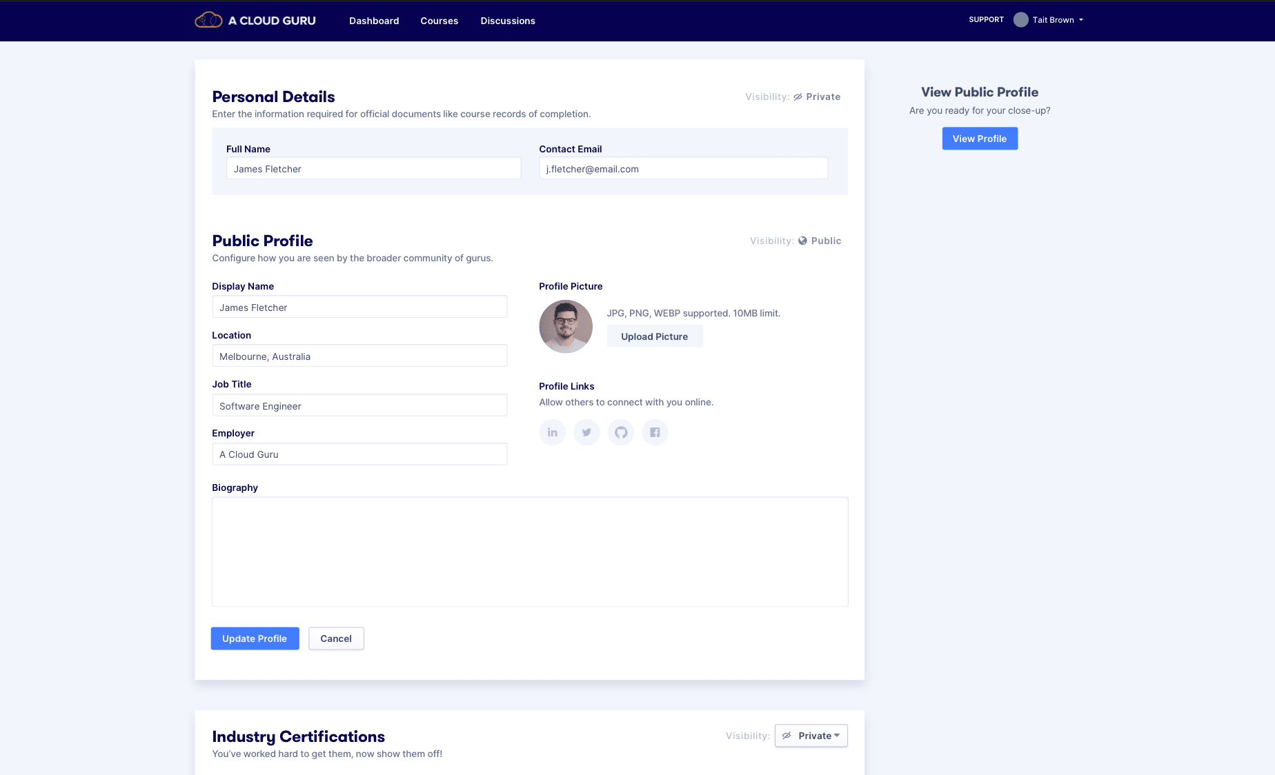
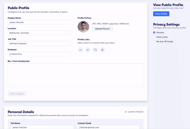
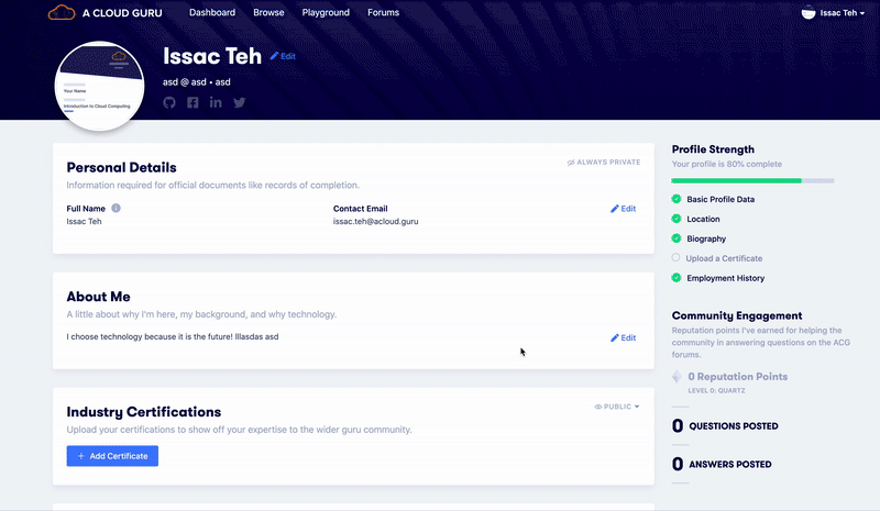
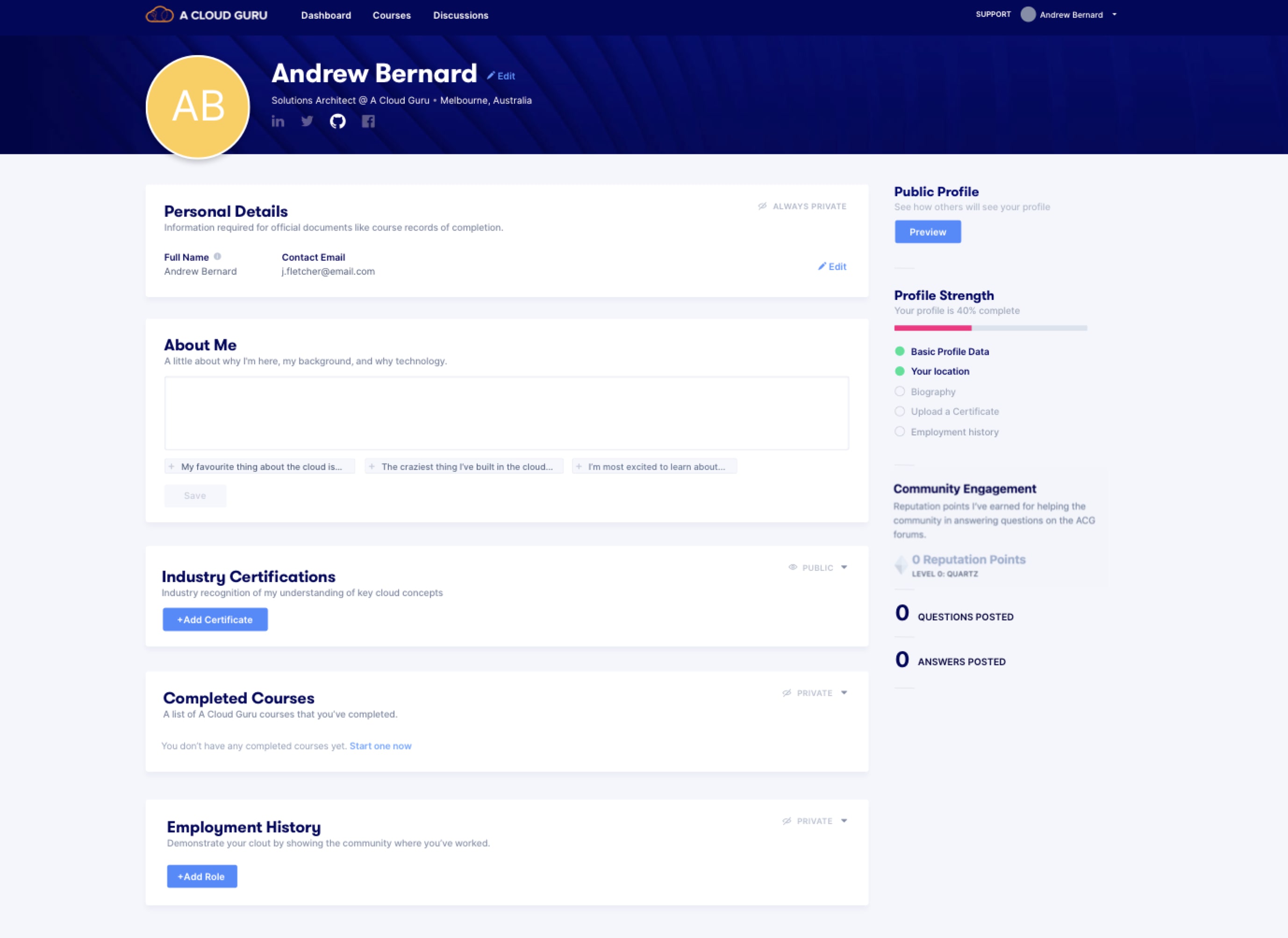
Privacy settings were misleading. To get users to add personal information like employment history, we needed to let them make parts of their profile private - but the controls weren't communicating that clearly.
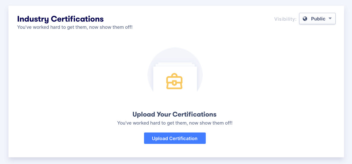
Legacy tech was creating limitations. The certificate uploader took users to a separate page and could only read certain file types, creating a clunky experience for something users needed to do regularly.
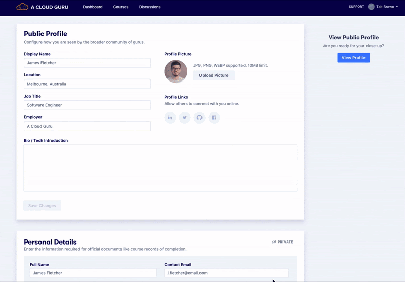
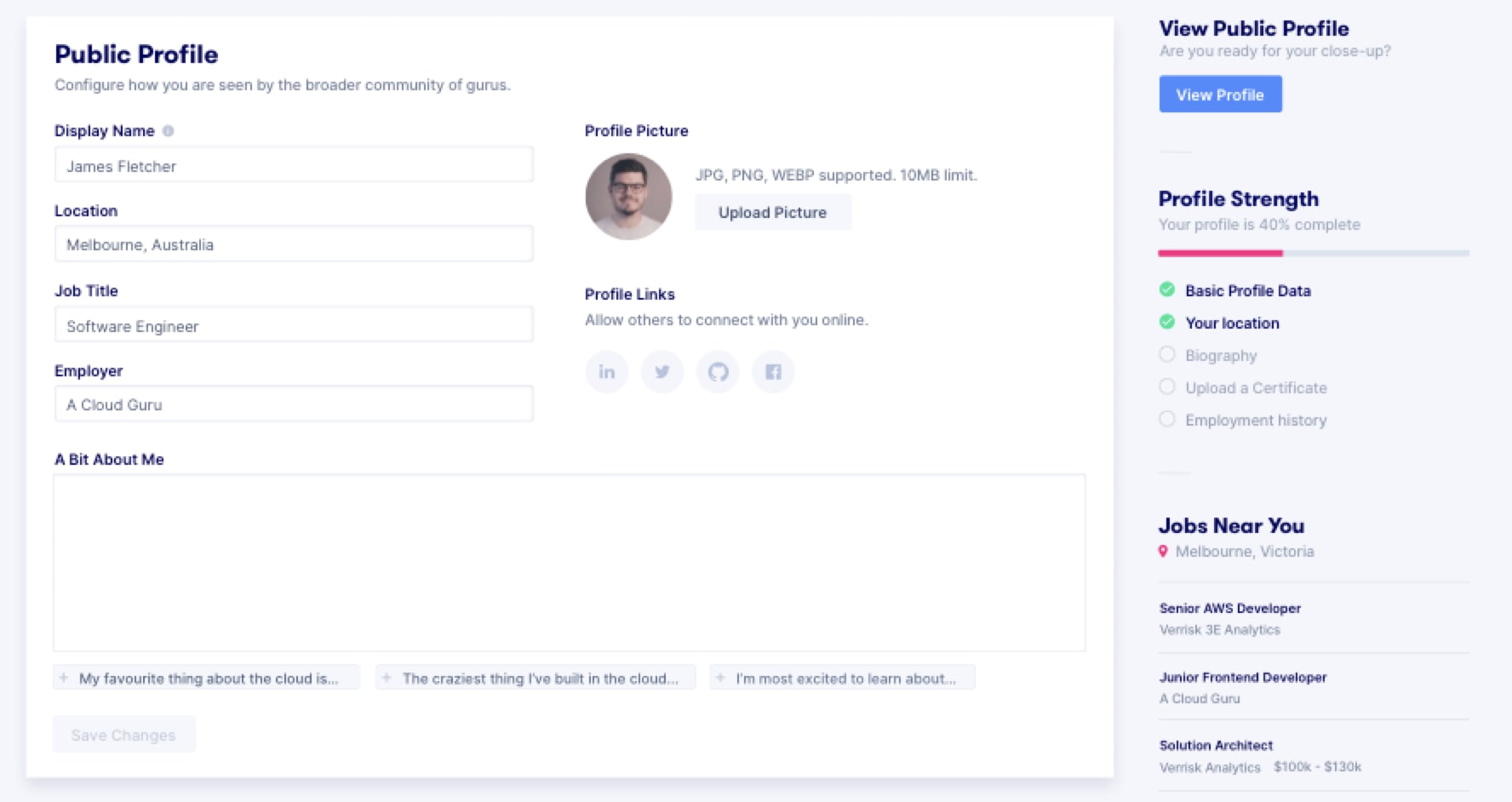
Usability friction. The profile was split across two separate pages - View and Edit - adding unnecessary navigation between them.
Research Activities
We ran internal feedback sessions and user tests. Key findings:
- Privacy toggles weren't working - users couldn't tell what was visible to whom
- Users expected information to be private by default unless they explicitly chose to share it
- There was a wide spectrum of what people wanted to keep private, so the solution needed to be as customisable as possible
- Language like "Course transcripts" and "Bio" was misleading some users into skipping those sections entirely
Privacy: Competitive Benchmarking
We studied three approaches in the wild:
- Stack Overflow - everyone gets a public profile; no granular toggling. If you want privacy, your profile is simply empty.
- GitHub - always populated with activity, so profiles are never blank. Privacy is implicit through what you choose to contribute.
- LinkedIn - a live preview with granular settings, letting users curate exactly what they present to different audiences.
Privacy Solutions
We explored three directions:
Solution 1: Granular settings - each section individually set to Private, Public, or Hirers Only, plus a separate public profile entity.
Solution 2: Dropdown-driven education, with privacy toggles only on auxiliary sections that default to public.
Solution 3: A global privacy setting that makes it easy to change overall visibility with the hirer option prominent - though this risked making full profile privacy too accessible.
Certificate Uploader
We redesigned the certificate flow into a modal - no more redirecting to a separate upload wizard. We added support for custom certificate entries, reducing errors from unreadable file uploads. This created a shorter feedback loop and a much cleaner experience.
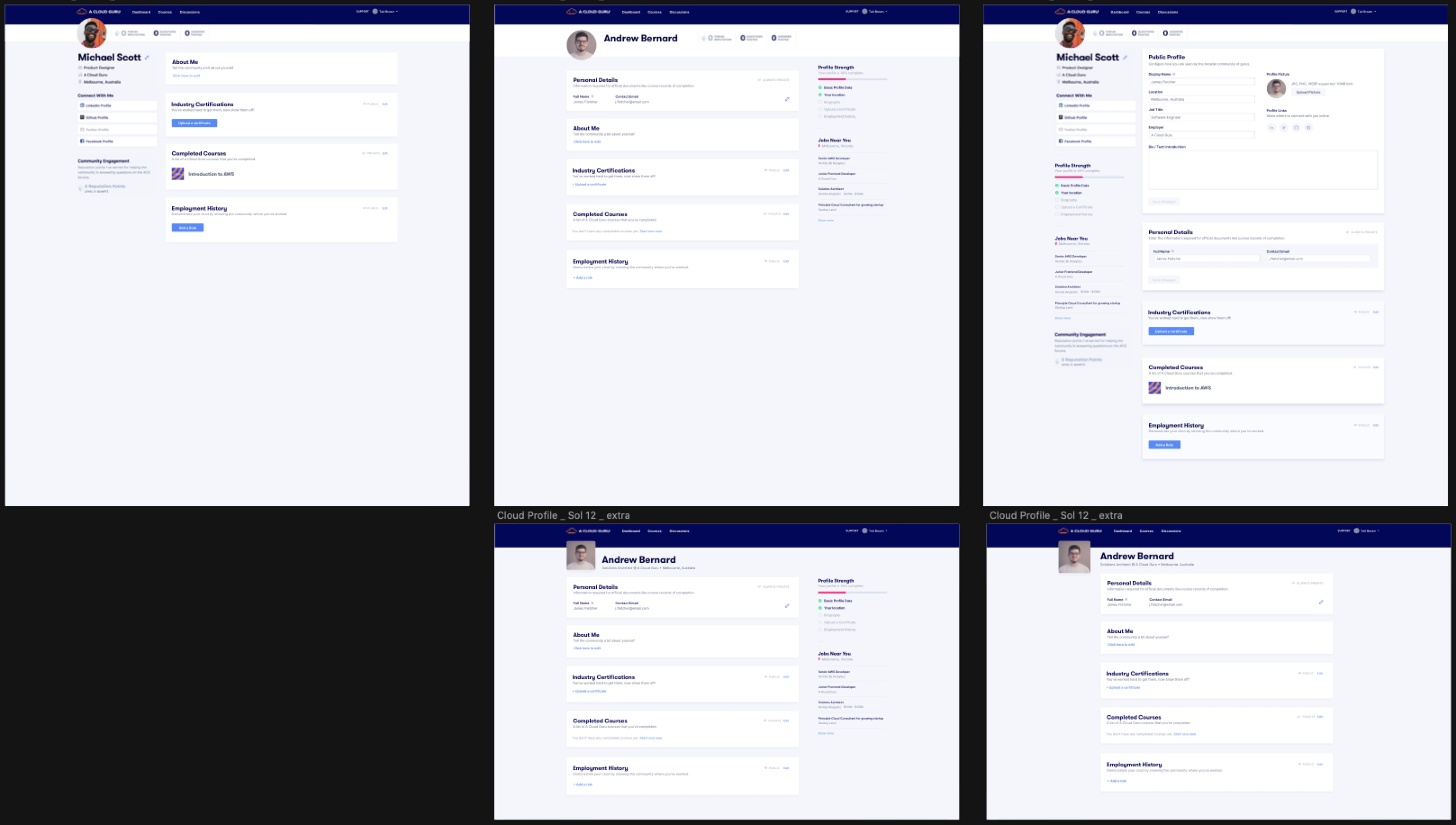
Usability: Inline Editing
With view and edit living on separate pages, users had to navigate back and forth constantly. We moved to inline editing - a pattern we'd validated through competitive research - so context never changed.
If you were the logged-in owner, all edit controls appeared. If you were a visitor, the interface simply dropped all edit functionality along with any sections marked private.
Conclusion
A profile page sounds simple. But the combination of three targeted improvements - privacy, certificate uploading, and usability - came together to create a meaningfully better experience. The research gave us a clear picture of users' mental models and what they actually needed from the product, making it possible to ship something that worked for both users and the business.
In retrospect: I'd create a more structured research framework from the start and use this as a mentoring opportunity - pairing junior team members with the research process rather than synthesising findings alone.