Problems
As part of an Activation and Onboarding initiative, we explored the first-time user journeys of people joining the platform. The log in and sign up page stood out as a clear opportunity.
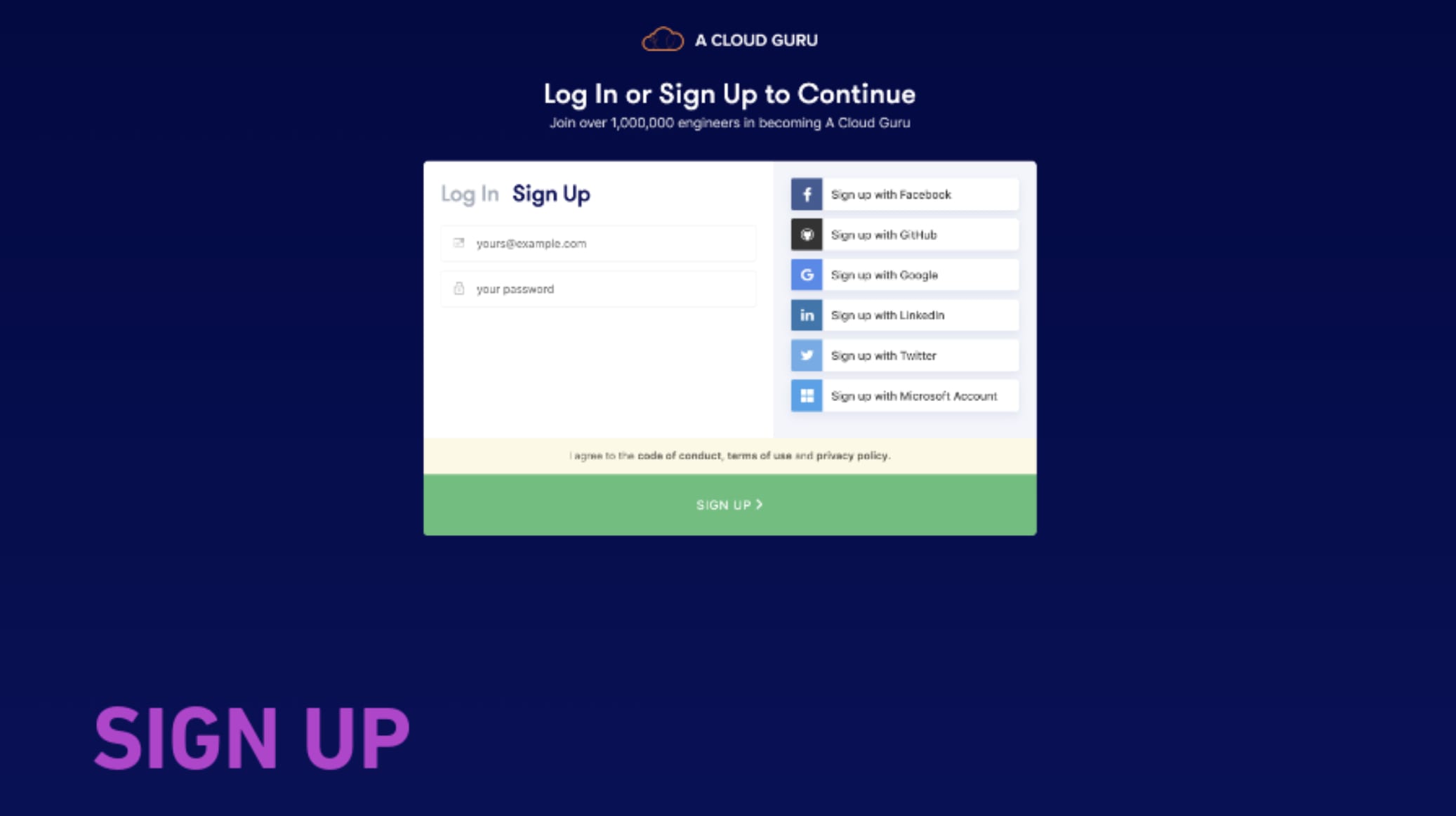
Four problems were driving drop-off:
- Conversion - we were looking at a 62% drop-off rate
- UI confusion - it wasn't clear whether users were on the Log In or Sign Up tab, and with social sign-on users would forget which method they'd used
- Tech limitations - the application was in Angular (not React), with redirects and limited tracking capability
- Support tickets - Zendesk data showed users found the password reset process difficult, likely because the link was hard to find
Research Activities
We ran 10 in-person tests (8 B2C, 2 B2B, with 2 participants who had never trialled the platform), explored 5 variations across the activation and onboarding journey, and reviewed competitors alongside other Auth0 log in and sign up implementations.
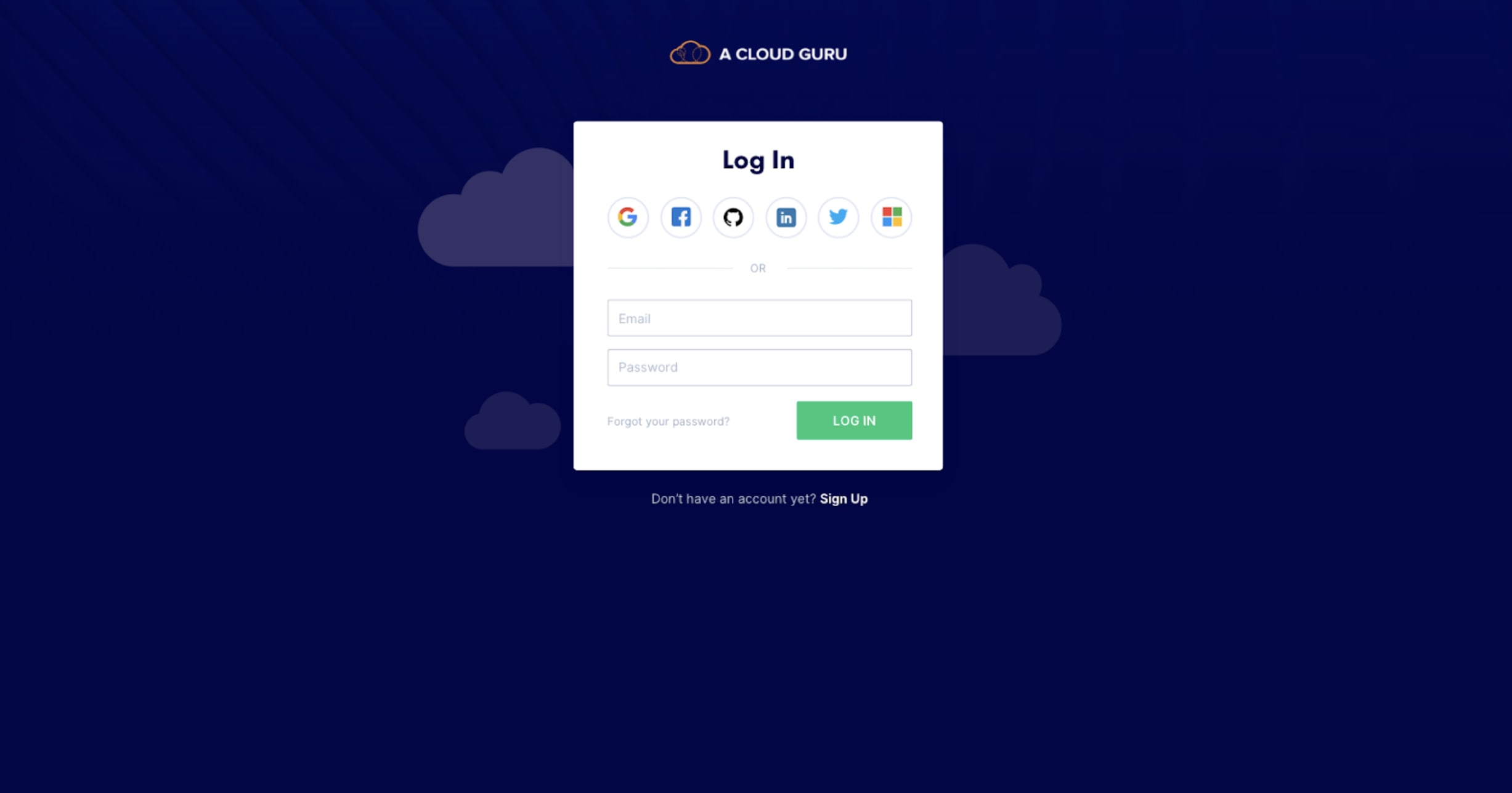
Iteration Round 1
We experimented with the scale of the social sign-in buttons to help users understand they were equal but different authentication methods. We also explored visually equalising the hierarchy - so social sign-on didn't feel like a lesser option than email and password.
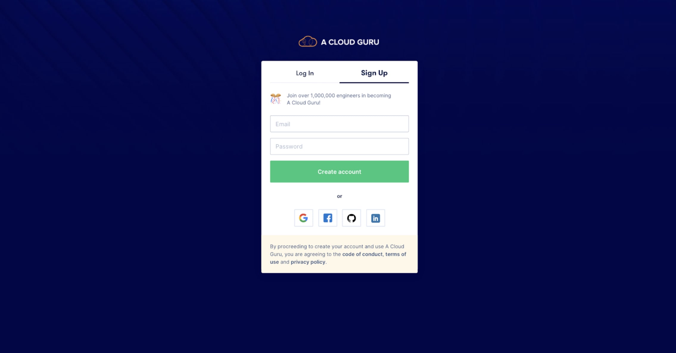
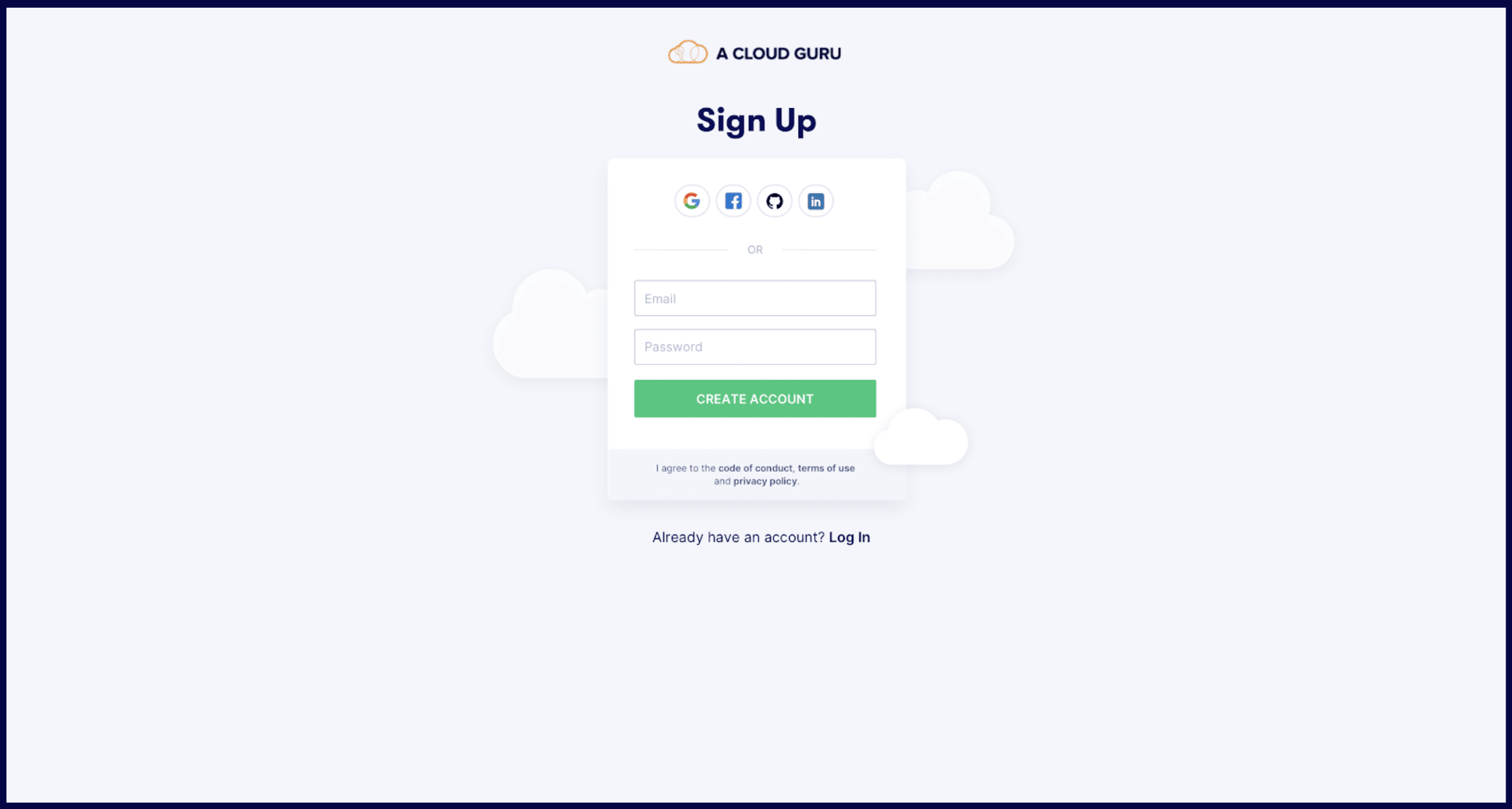
Iteration Round 2
We pushed further - deviating from standard Auth0 templates, splitting Log In and Sign Up into separate flows, and exploring different copy hierarchies. Crit feedback favoured a large full-width CTA over a small one. We also explored adding more personality to the layout.
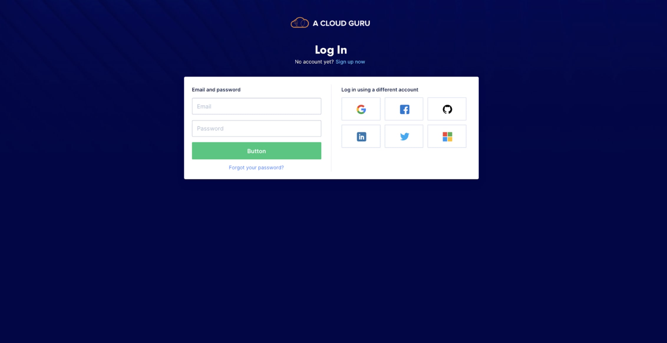
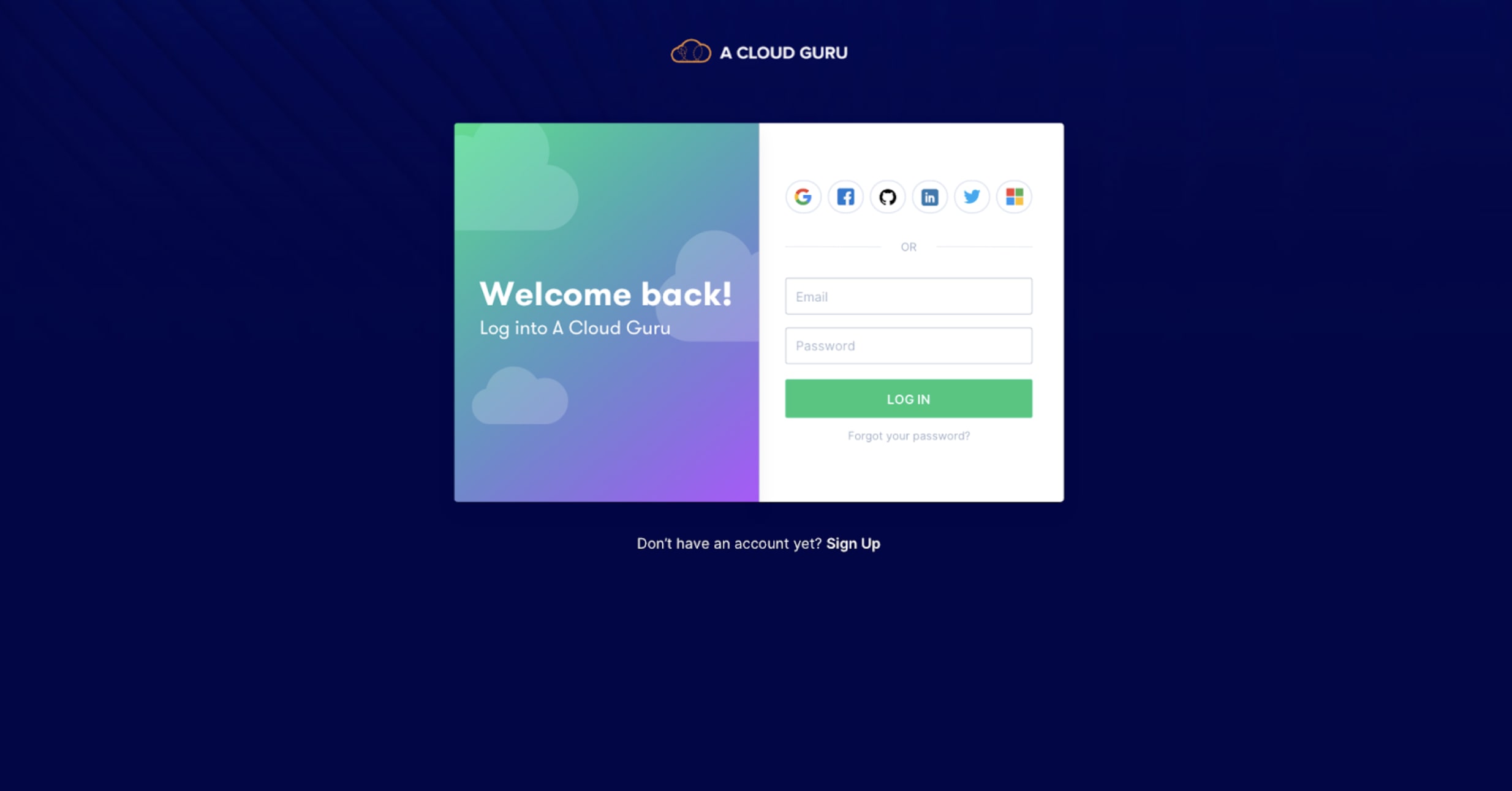
Iteration Round 3
We started exploring radically different layouts, heavily influenced by research into what others were doing and login/signup best practices. We played with different ways of incorporating personality and colour. Crit feedback: experiment breaking out of the container and making the design feel less heavy.
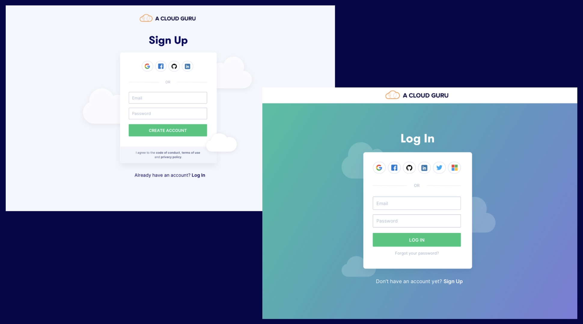
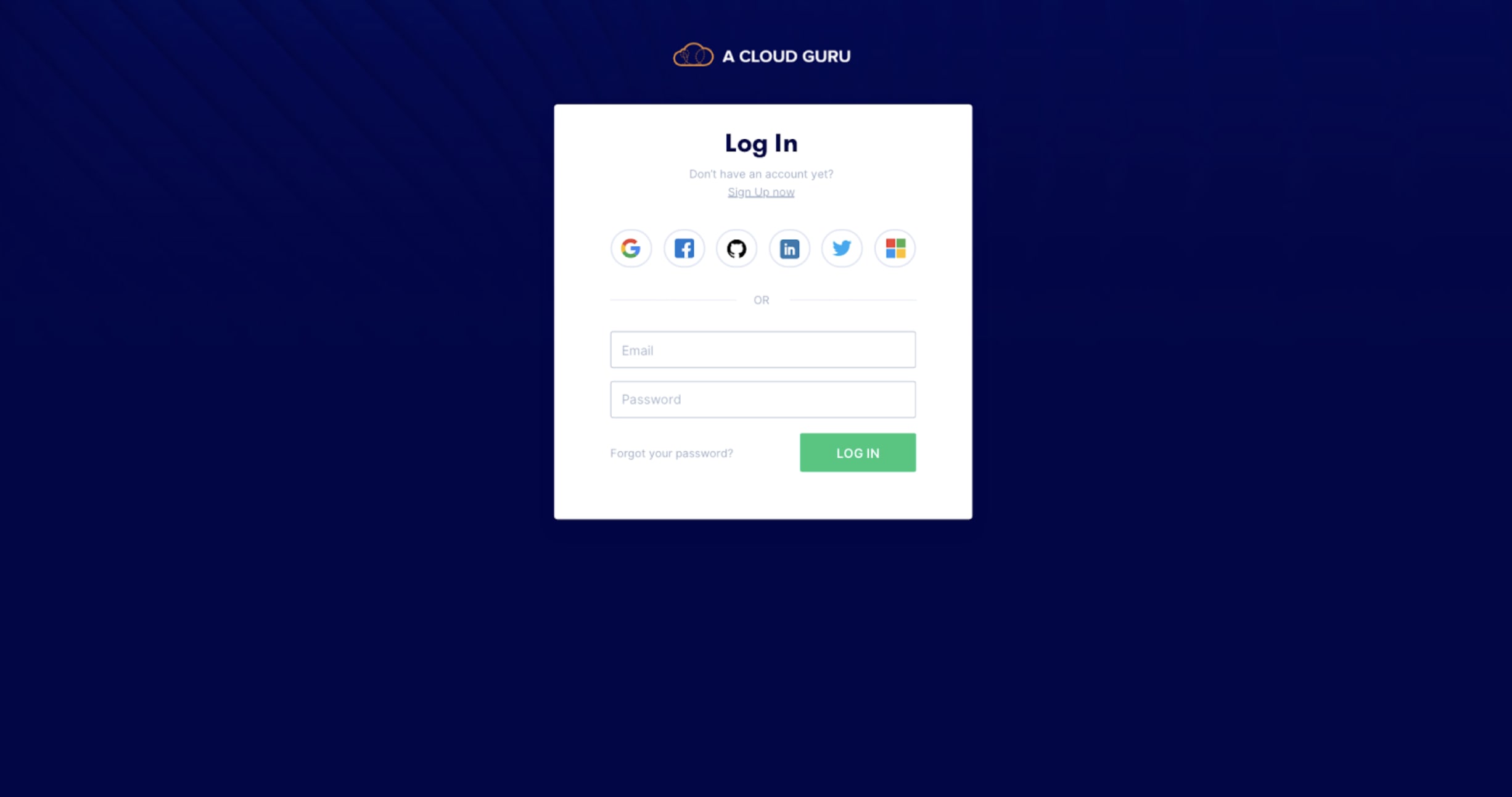
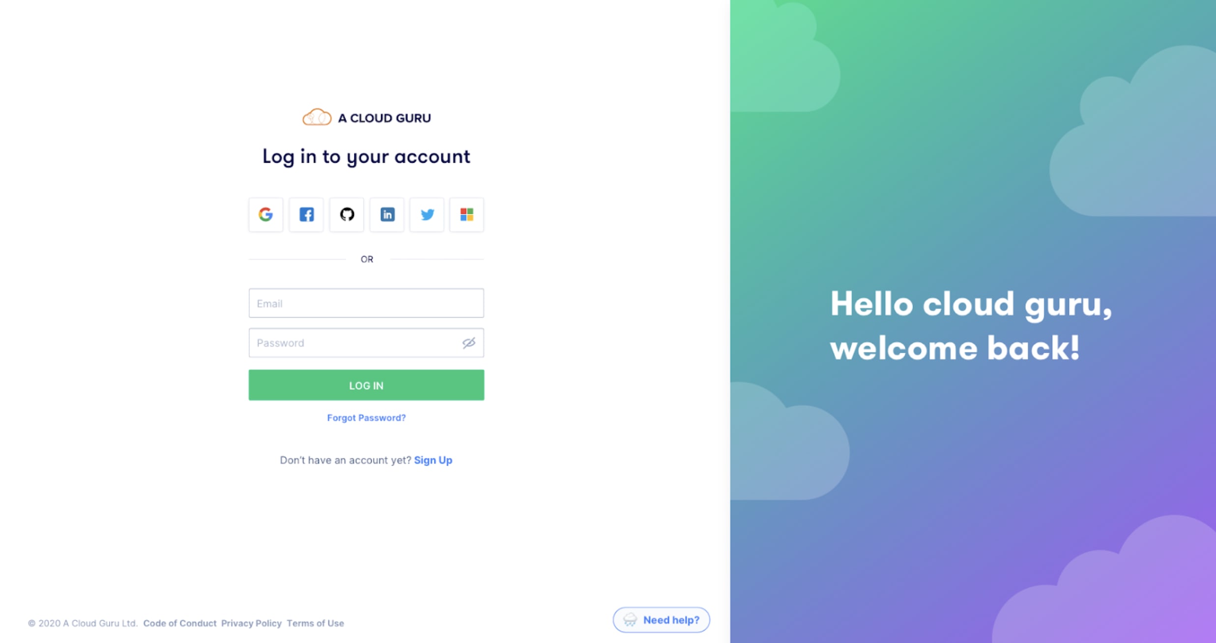
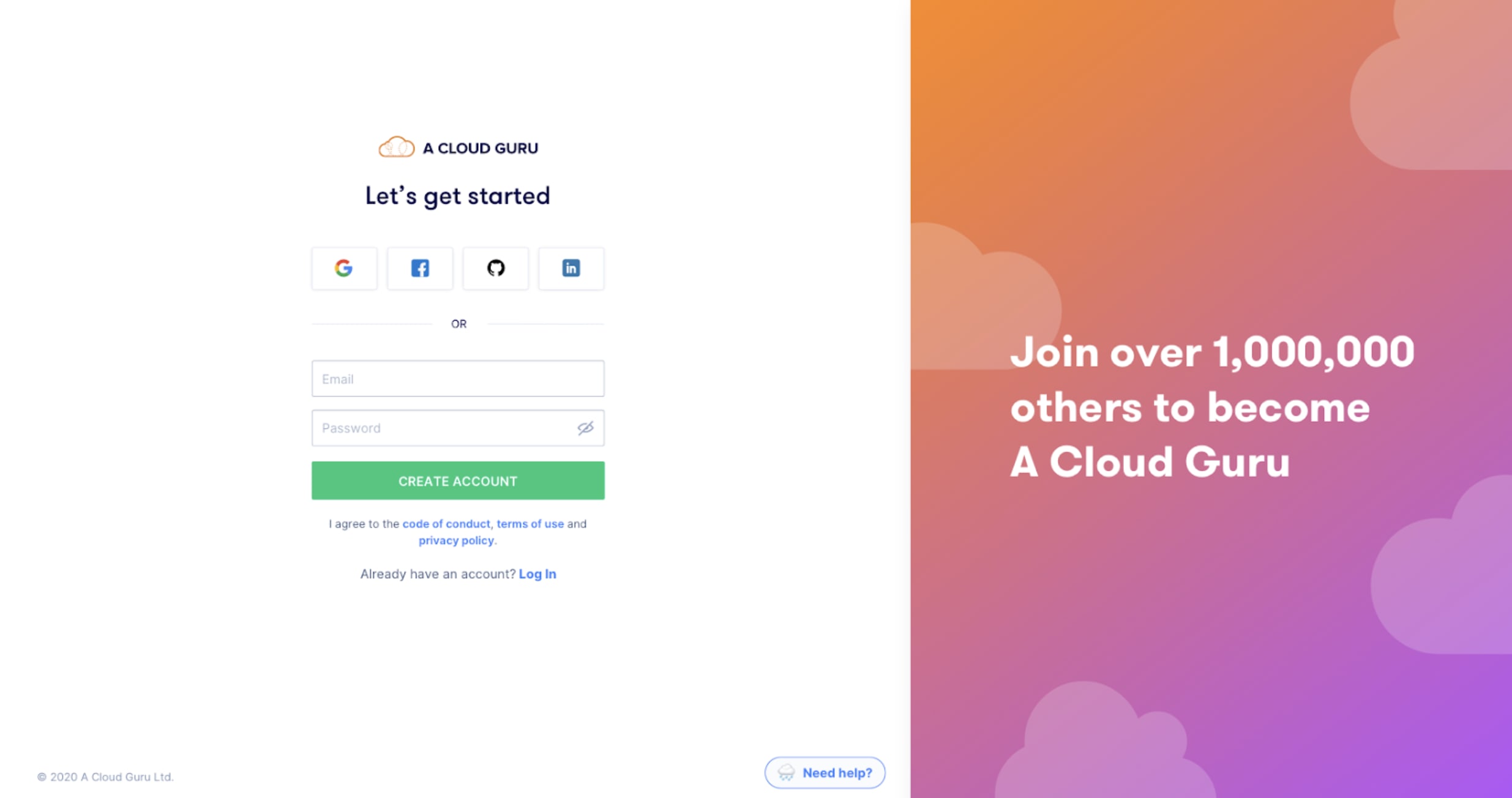
Final Solution
The final solution was confirmed through multiple rounds of internal feedback and user testing. The core principle: remove every distraction and help users focus on their job to be done.
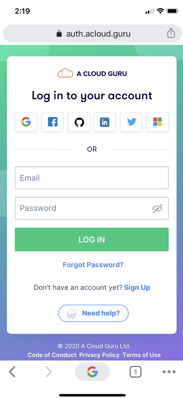
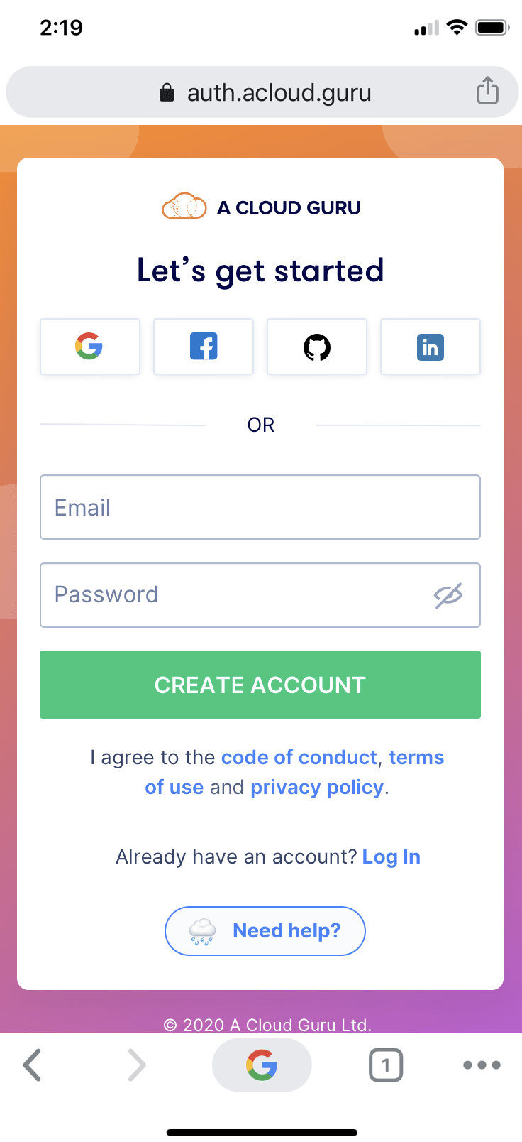
Key decisions in the final design: a quick way for users to get help, a footer with privacy and copyright information, supporting copy on the right side (not the left, to avoid distraction from the primary action), and a mobile-responsive version.
In retrospect: this project reinforced the value of leading with data. Using the 62% drop-off figure to build the business case is what got stakeholders to prioritise it. As a design leader, I'd now establish a regular experimentation cadence so the team runs hypothesis-driven improvements continuously - not just when a problem becomes impossible to ignore.