The Problem
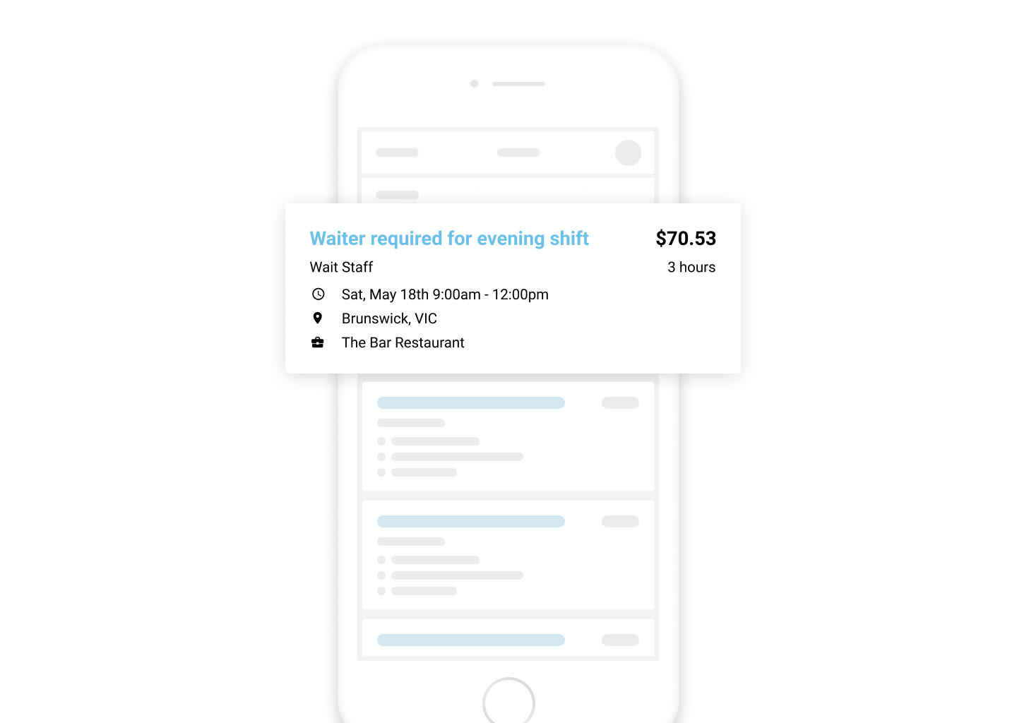
Workers viewed and applied for jobs via a mobile app. Jobs were displayed as cards in a feed - a familiar pattern. But there was a tension baked into the model: businesses that posted more jobs got greater visibility, while smaller businesses with only one active posting got pushed down the feed. We also suspected the experience was overwhelming - we were asking workers to consume a lot of information at once.
Starting Point
We started by collecting stakeholder feedback internally to sharpen our problem definition. Once we had that, we began to ideate - what could we do to make this feed better?
Data
We needed data to understand what workers were actually looking for. I ran a survey with 50 workers, asking what mattered most when looking for casual employment and what they prioritised when browsing a job board.
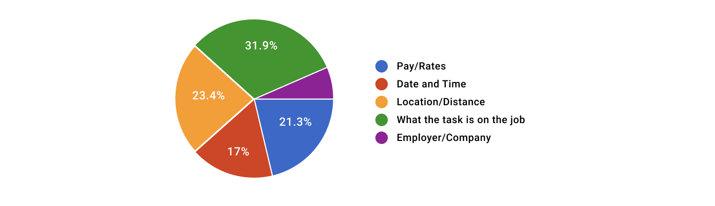
Three things stood out:
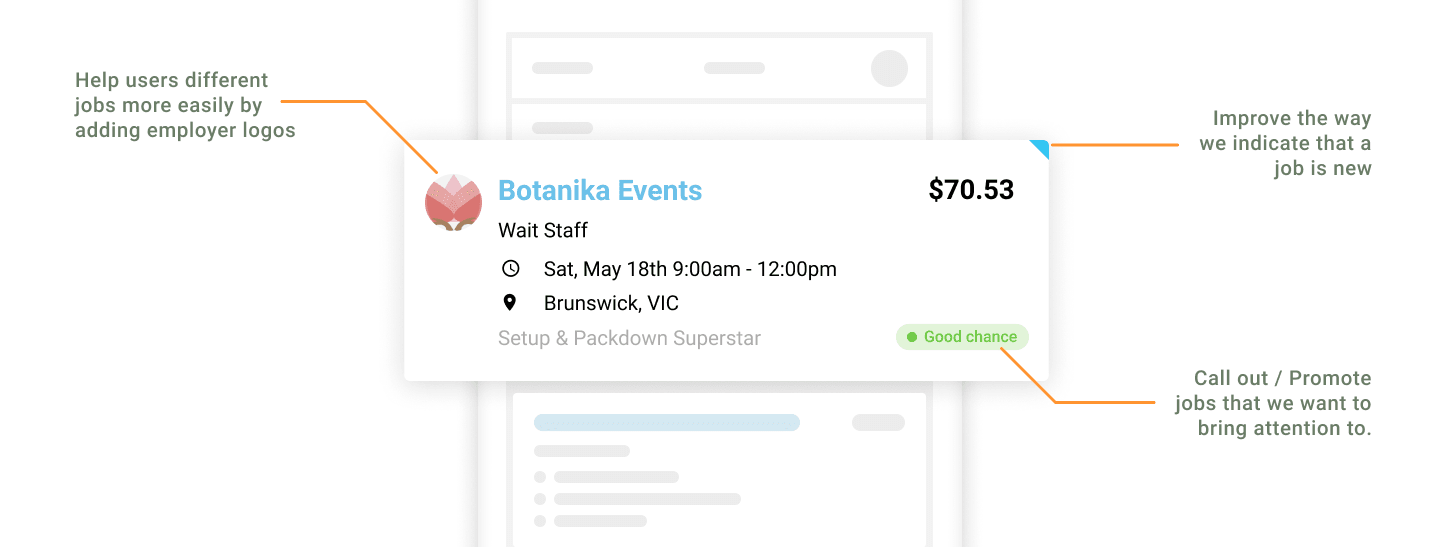
- Employer logos weren't useful - workers cared about the job itself and whether they could do it, not who they'd be working for
- We weren't convinced the "Good chance" tag was actually helpful in surfacing relevant jobs
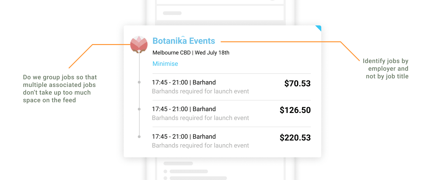
- We needed to figure out how to sort jobs depending on how we grouped them
Speed Testing
With a clearer picture of the problem and what people were looking for, we moved into rapid user testing. The insight that made this work: when workers came into our office for onboardings, I'd sit them down for a quick 10-15 minute test on a prototype. First impressions, how they'd use it, what confused them. Then I'd make changes and be ready for the next session.
This turned onboarding sessions into a continuous feedback loop - no need to schedule dedicated research sessions.
User Test #1
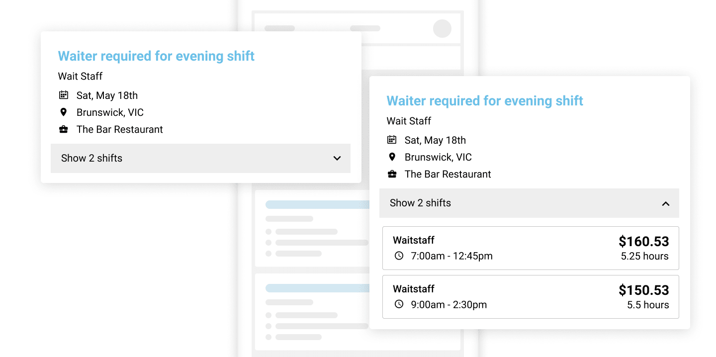
Three participants, two options. They liked being able to see more shifts at a glance, and broadly appreciated the information density - the more you know about a job without clicking through, the better.
Areas to improve: better communicate the idea of multiple shifts vs. multiple jobs, and make it clearer where to click to expand cards.
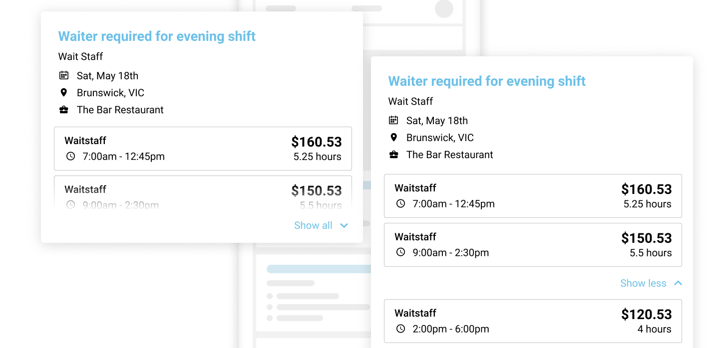
User Test #2
Four participants plus internal feedback. Users found jobs by date easily and the interface felt clean and simple. Areas to improve: explore bulk actions like multi-select or checkboxes, differentiate roles more clearly, and keep working on communicating multiple shifts vs. multiple jobs.
User Test #3
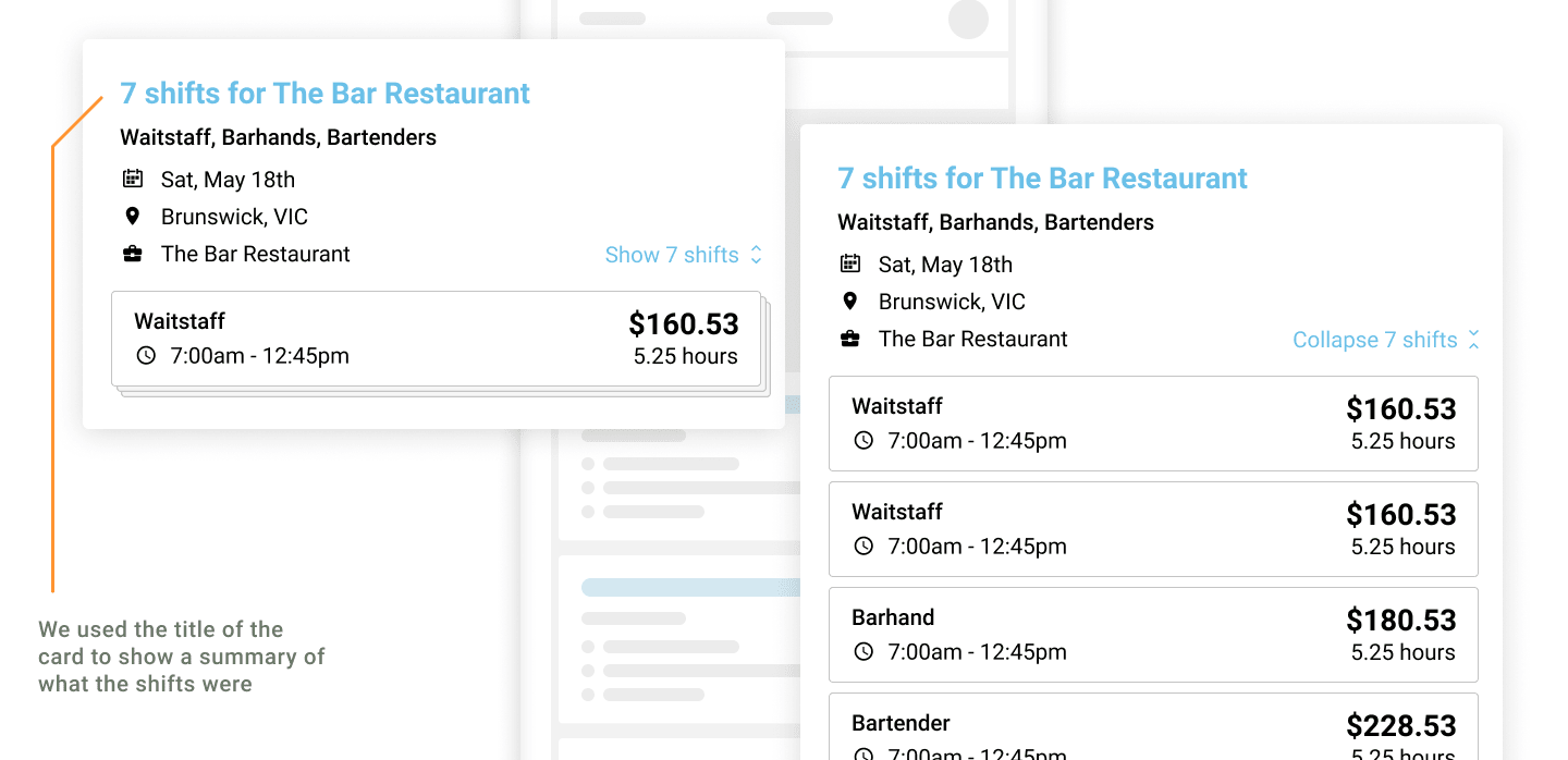
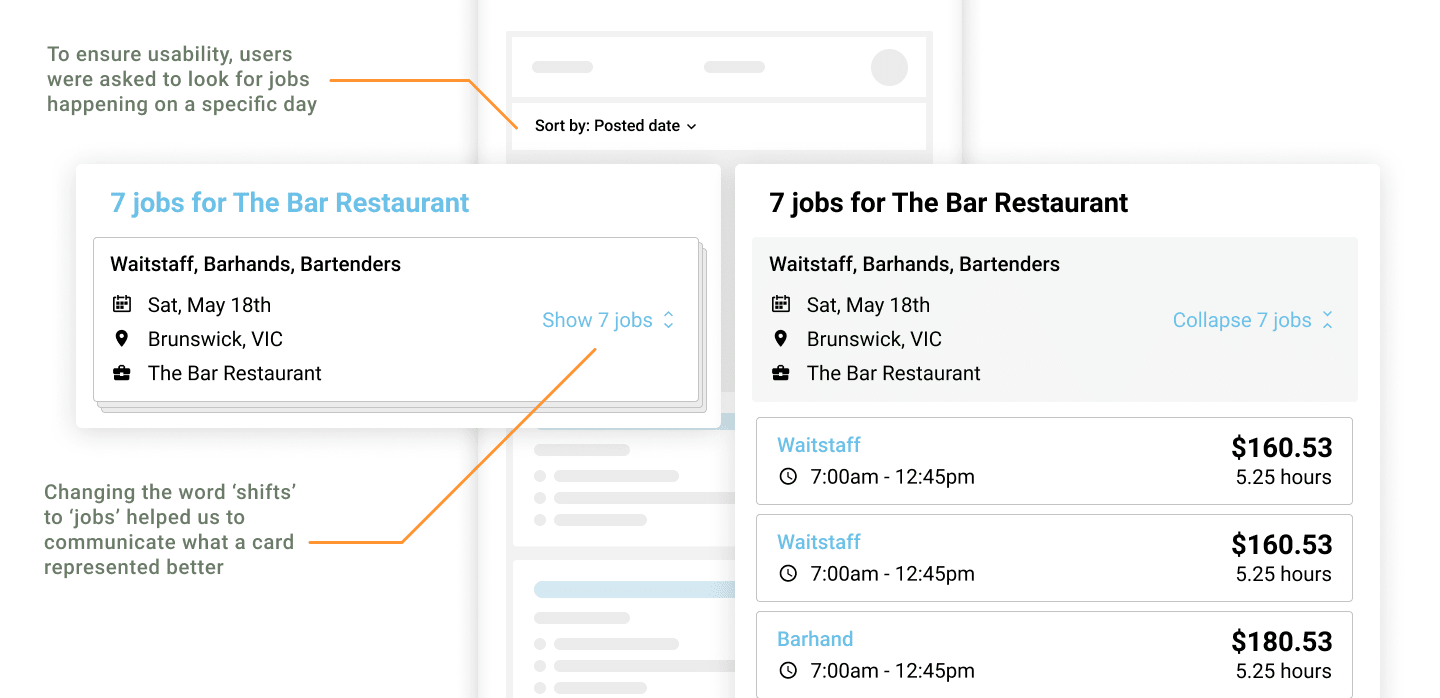
Four participants. By this point, things clicked. Users understood the cards represented jobs and felt the information was complete. When asked to filter jobs by date, everyone did it without hesitation. No confusion about where to click, no confusion about multiple shifts vs. multiple jobs.
Conclusion
Testing fast and often compressed what could have been months of back-and-forth into a handful of short sessions. The rapid cycle - prototype, test, refine, repeat - let us catch nuances early and build something that genuinely worked for the people using it.
The guerrilla testing setup using onboarding sessions was the real unlock. It gave us a steady stream of real users without any scheduling overhead, and the team continued using this approach long after the project wrapped.
In retrospect: as a design leader, I'd bring a junior designer in to shadow the testing process as a learning opportunity - and pair on synthesis rather than doing it solo. The methodology was solid; the leverage could have been higher.