I haven't put Zeller Invoicing in my portfolio for a while. The reason is that the way we built it didn't follow the playbook I'd usually point to in a case study. There was no discovery phase, no customer interviews up front, no journey maps pinned to a wall before pixels were pushed. The philosophy at the time was build, ship, and let real customers push back. It's a legitimate way to work, and it suits a certain kind of team and stage. It just made for an unusual story to tell.
So rather than write the standard "here's how we shipped" piece, I want to write the one I find more useful: what I'd do differently next time. The work is some of the UI I'm most proud of, and the project did well. But the gaps in our approach were where most of my learning lived.
Don't fixate on perfection
We worked closely with the CEO, who reviewed details carefully and held a high bar for the UI. That bar is a good thing. But when you don't have customer inputs to anchor decisions, every call starts to feel like a debate about taste, and debates about taste don't get resolved. They get outlasted.
The cost of indecision in a business is almost always higher than the cost of a wrong decision. Decisions compound across teams and timelines. Designers and PMs need to be able to back themselves: not arrogantly, but with a defensible point of view that gets the team unstuck. If there's no data to point at, a clear opinion held well is the next best anchor.
Don't commit too early to a specific UX
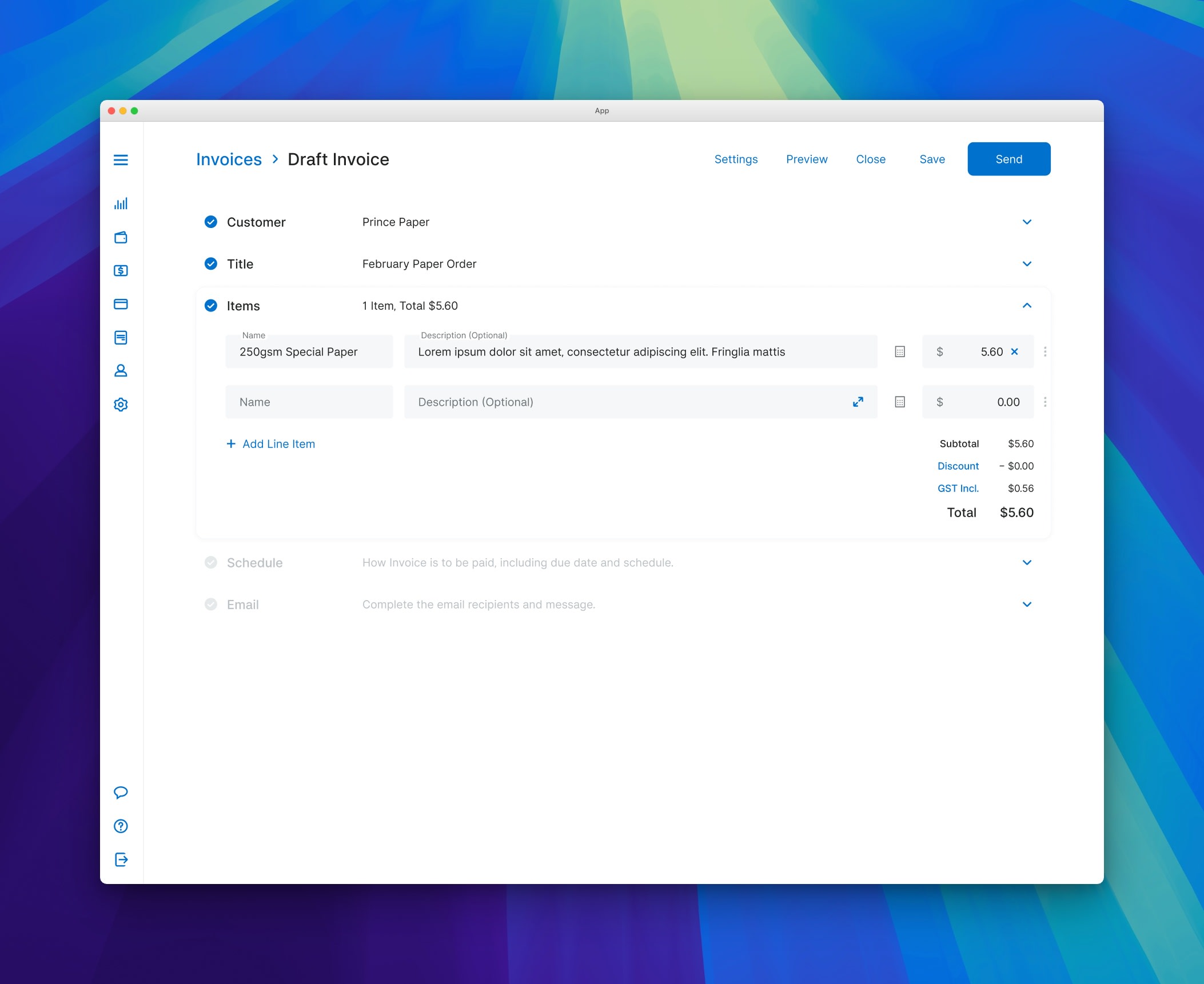
I anchored on a Mailchimp-style, step-through flow for invoice creation early in the project. It was a familiar pattern, it felt friendly, and it gave the team something concrete to react to. All good reasons.
The problem was that once it was in front of stakeholders, it became "the design." Defending it became part of my job. Walking it back became expensive, politically more than practically. By the time we realised the wizard shape wasn't right for some of the journeys, we'd built so much around it that any rethink was disruptive.
What I'd do now is hold the first idea loosely. Put it next to two or three alternatives, even if there's a favourite. Make it cheap to walk away from before it gets canonised.
Understand the journey before designing the screen
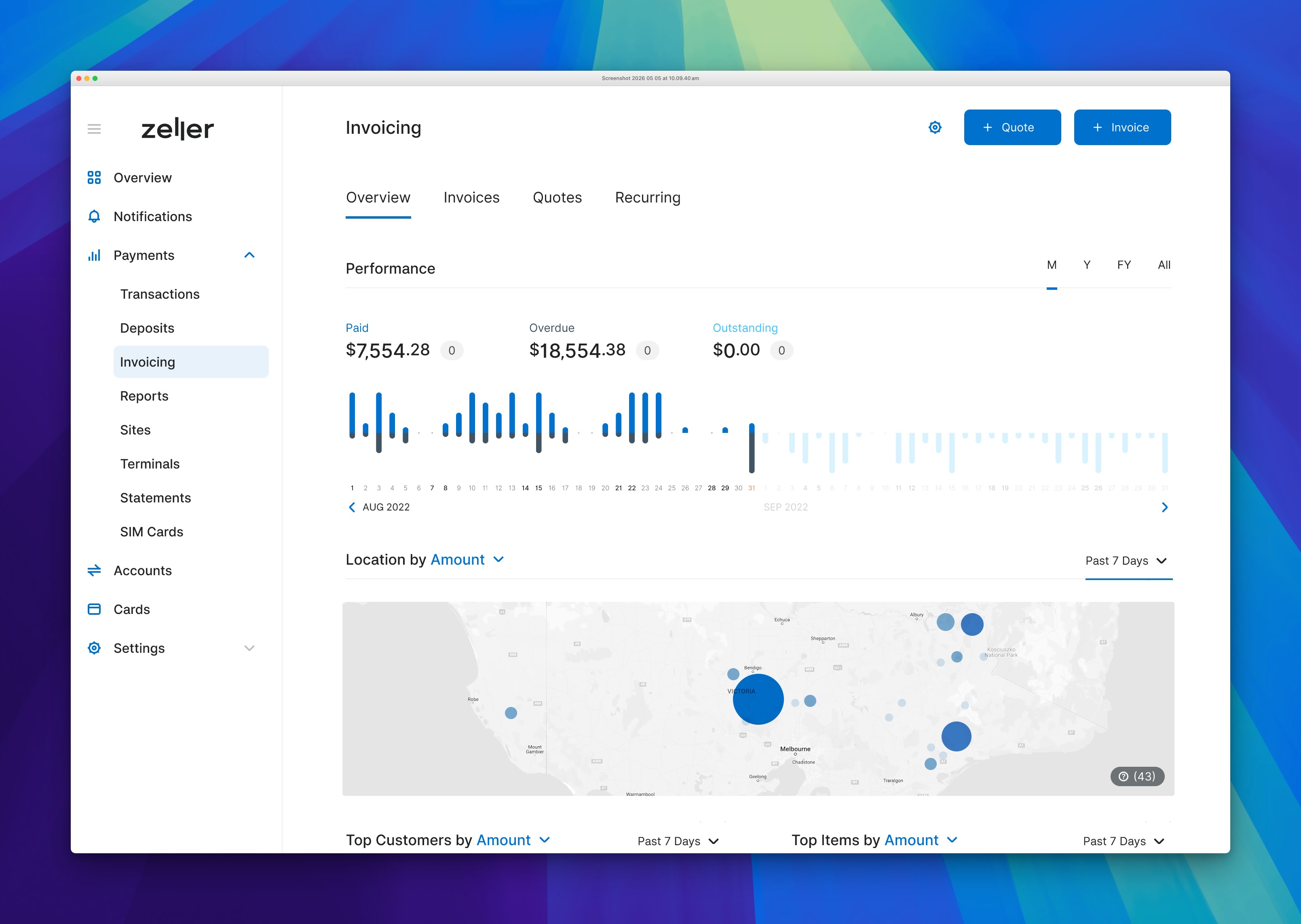
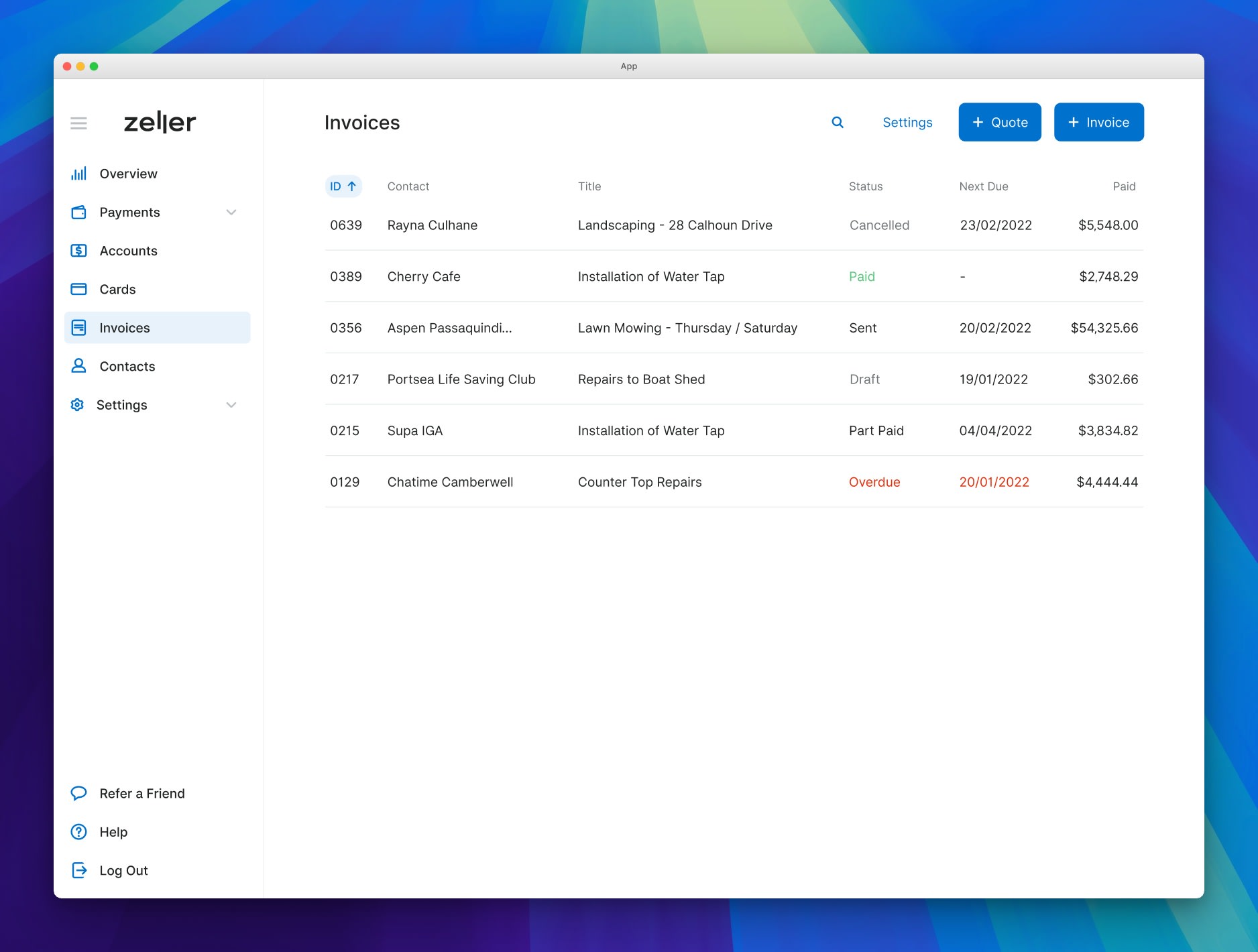
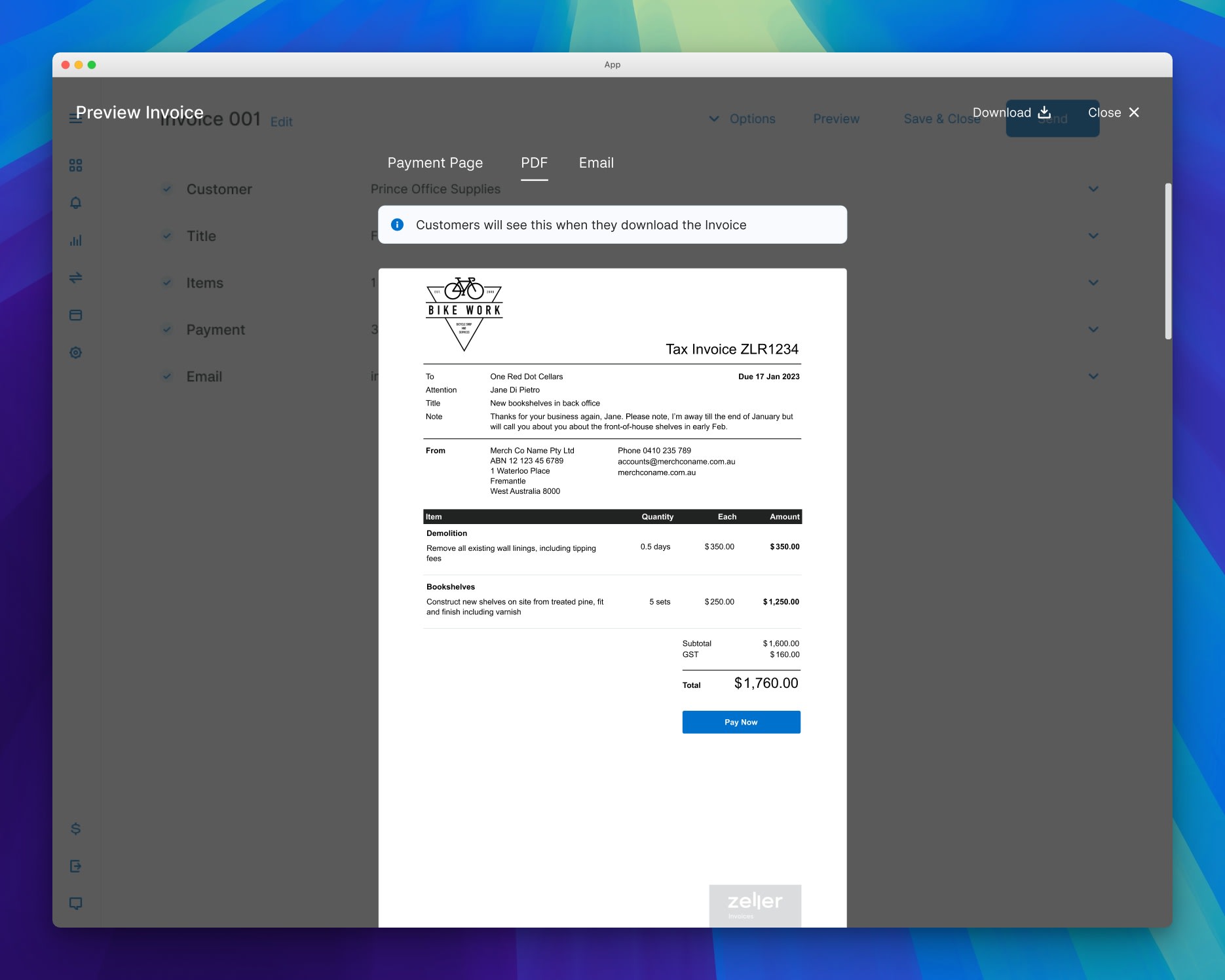
Invoicing looks simple. You make an invoice, you send it, you get paid. We learned, late, that "an invoicing tool" is not one screen or even one flow. It's a creation experience, an invoice list, the actual invoice document the recipient receives, a payment mechanism, reminders and status changes, edits and voids, and reporting sitting on top of all of it.
We started designing the front of the experience before we'd mapped the loop. So we'd finish one piece, lock it in, then find that the next piece needed something we'd already committed to. Small things individually, but they accumulated.
The lesson is one I now apply by default: journeys first, screens second. Even a rough sketch of the full loop is more useful than a polished version of one corner of it.
Mapping the journey also surfaced features we hadn't planned for. Once we understood how people who sent invoices actually worked, it became clear that many of them sent a quote first - a step that sat entirely outside our original scope. That insight led us to build Quotes as a distinct feature, one that fed naturally into invoice creation. We wouldn't have seen the need for it if we'd stayed focused on the invoice screen alone.
Think in ecosystems, not features
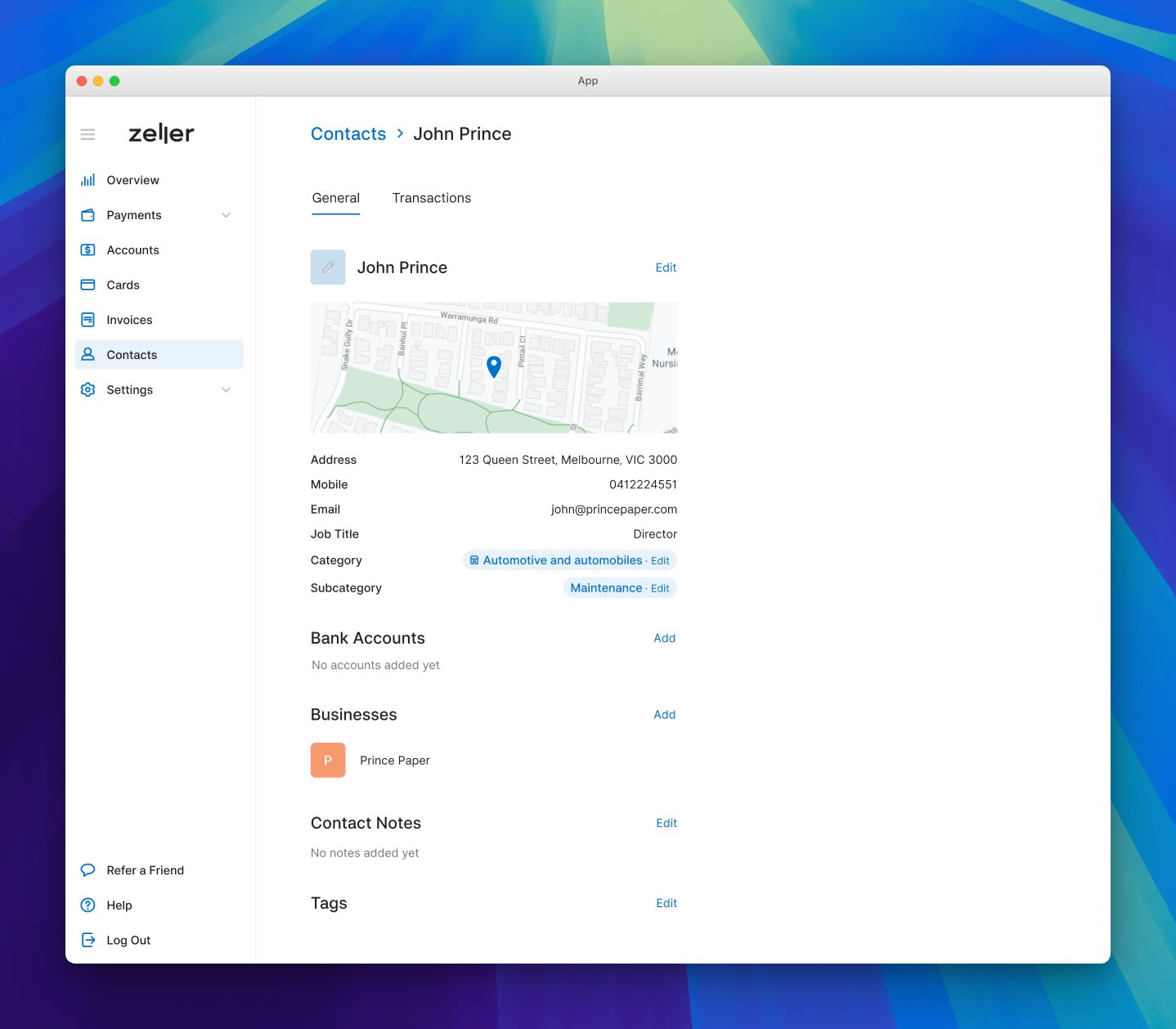
The flip side of designing journeys first is recognising that features don't live alone, and the Invoicing work made this concrete for me. The tool didn't stay an "invoicing tool" for long. It spawned Contacts, a place to manage the customers you were billing. And it started working with Inventory, so people selling products rather than services could pull items straight onto an invoice.
What started as one feature became three connected ones. The connections weren't accidental either. They were what made the experience feel like a platform instead of a collection of tools.
This is a lesson I'd take forward rather than avoid. When you're designing a feature inside a platform, the question isn't only "what does this feature need to do?" It's also "what does it unlock, share, or borrow from the rest of the system?" The good ideas often live at those edges. Contacts existed because Invoicing needed somewhere for customers to live. Inventory came into the picture because it solved a problem Invoicing surfaced. Neither would have come up if we'd treated Invoicing as a self-contained thing.
What I took from it
The build-and-ship philosophy taught me to be less precious about my work. The absence of research taught me how much I'd been leaning on it without realising. And the close scrutiny on every detail taught me when to hold ground and when to fold.
I wouldn't change Zeller's way of working. It's a real philosophy and it suits the company. What I'd change is how I showed up inside it: with journeys and the wider ecosystem mapped before screens, options held lightly, and a stronger backbone for the calls I believed in.